I’ve noticed a few posts in the comments and over in forums regarding inventory levels – which appear to be flat to down over the last couple of weeks. Given these I thought it was worth laying out a historical perspective on inventory levels.
If you’ve delved into the Seattle Bubble spreadsheet, you know that The Tim has collected NWMLS stats for KingCo SFH back to January 2000. Based on this data, you can get a pretty good feel for how inventory levels rise and fall over time, and what today’s market looks like compared to previous years.
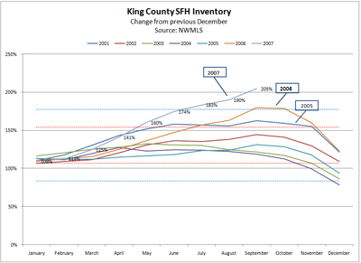
First, lets have a look at seasonality. The chart below compares normalized inventory levels for each year – relative to inventory at the beginning of the year (or, more precisely – versus December 31 of the prior year). As you can see, fluctuations by month are fairly predictable across the years – lowest at the beginning of the year, growing steadily through fall, and then dropping off in Oct-Dec. For the 69 months of data charted below, the standard deviation from the BoY inventory is +/- 23% of the average change of 130% of BoY inventory. So if my recollection from stats class is correct – 68% of the time inventory change falls within one standard deviation of the average change (red dashed line), and 95% of the time inventory changes fall within 2 standard deviations of the average change (blue dashed line)
What is atypical about the market in 2007 is that since July of this year, the inventory growth has been more than 2 standard deviations higher (<3% probability) than the 2006 year ending inventory – and the September change was 3.2 standard deviations outside the norm – an event which I think has about a 0.1% probability of occuring! So while inventory is following a typical pattern – the swings in inventory have clearly been far outside the norm, and only to the upside.
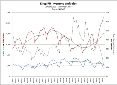
The next chart shows the absolute inventory levels, and compares them to sales. On this chart, you seen the same seasonal fluctuations as above, but in context of the yearly swings of the market. You can also cleary see that it’s not just the relative inventory level that is an issue – the number of homes currently on the market is almost 3 standard deviations above the average for 2000-2007; an event which again, has about a 0.1% probability of occuring. The dashed black line shows the rate of absorption – calculated as pending sales/active listings for each month. As you can see, the growth in inventory is not in any way being met by an increase in sales. The level of inventory absorption has dropped to its lowest level in seven years.
So, while some may argue about how much impact all this inventory will have on prices, it seems pretty clear that any arguments that the market is just returning to “normal” levels of inventory are coming from sources that either haven’t looked at the data, or that are just plain bad at math…

