In a lot of the feedback we’ve been getting lately, two recurring themes are a desire for more number-crunching and more neighborhood analysis. So, let’s have some of both those things. Let’s take a more detailed look at single-family house inventory over the last year, broken down by neighborhood.
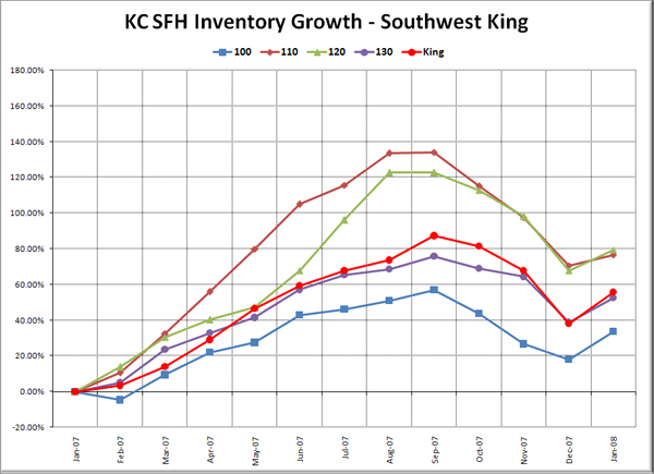
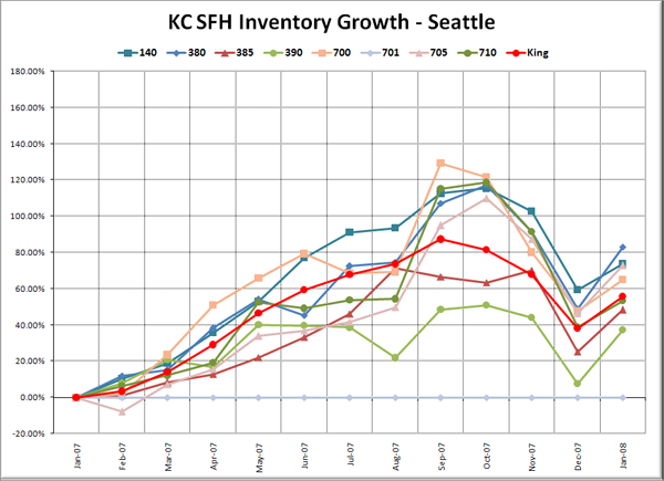
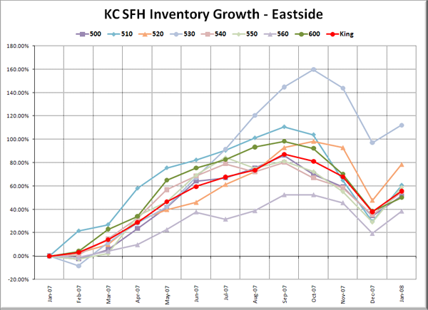
What I’ve done below is to take the “Res Only” data from the NWMLS King County Breakout pdfs for January 2007 through January 2008, and plot the total percent growth. I’ve broken the data into five separate graphs (the same groups the NWMLS uses in the breakout pdfs), in order to make it more digestable, but each graph still has the same scale on the vertical axis, so they can be easily compared. Additionally, each graph has the King County aggregate figure plotted in red with circles marking the data points.
For a description of which neighborhoods each area encompasses, as well as a map of the areas and a link to the source data, visit this page.
Note: Area 701 (Downtown Seattle) started the year with zero listings, then went up to 1 in June and 2 in January ’08, which would techincally have been an infinite percentage increase. On this chart it is displayed as a flat line.
So what stands out in all this data?
First off, except for areas 110, 120, and 340 (Federal Way, Des Moines, and S. Renton), South King County doesn’t really stick out as much worse off than the county as a whole. In fact, in areas 300 and 350 (Enumclaw and N. Renton), inventory grew considerably slower than most of the county.
Most areas in Seattle proper trended fairly close to the county total, with area 390 (Capitol Hill) seeing the slowest growth. The Eastside was even more average, with the exceptions of 560 (Kirkland) on the low end and 530 (E. Bellevue) skyrocketing starting in August. North King and Vashon came in above average, with inventory on Vashon climbing the most of any area in the county.
Inventory-wise, the strongest areas (least inventory growth) as of last month were 300 (Enumclaw – 18% YOY), 320 (Maple Valley – 31% YOY), and 350 (Renton Highlands – 32% YOY). The weakest areas (most inventory growth) were 800 (Vashon – 97% YOY), 340 (S. Renton – 107% YOY), and 530 (E. Bellevue – 112%).
Make of this data what you will.


