As a follow-on to Tim’s post yesterday about the practice of relisting properties, here is a look at what has been happening to inventory over the past few years, and how the trends have changed over time.
The questions “what is happening with all of those listings” and “how many sellers just give up?” have come up a number of time from readers. The latter question is particularly interesting – because it might tell you something about seller psychology. Logically, one would expect sellers to rarely pull listings in an up market. The rising tide is probably lifting all boats. But in a down market, what happens? Will sellers start pulling listings because they expect prices to go up soon and want to wait out the dip? Will they keep their homes on the market because they need to sell, or because they think things will be worse if they wait?
The NWMLS reporting on inventory is decidedly opaque. They report homes sold, pending, added, and active. What they don’t tell you is how many homes remained on the market, or how many sellers just gave up and took their homes off the market. However, if one looks across months, some pretty basic algebra allows you to back into how many homes are de-listed versus left on the market.
- You can get to delisted inventory as follows: [(Beginning inventory + New listings) – (Pending listings (sold) + Ending Inventory) = Delisted]. Take the available stock less what is either sold or left over, and it tells you how many homes disappeared from the listings that month without being sold…
- Armed with that, you can calculate how many homes stayed on the market as follows: [Beginning inventory – Pending listings (sold) – Delisted = Stayed]. Take the total starting inventory, and subtract those that sold or gave up, and all you have left is the stuff that stayed on the market!
Using those formulas applied to the last 9 years of inventory data, we can peer inside what has been happening with listings before and during the boom:
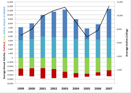
On the left axis, we have the average number of homes delisted, sold, added, and staying on the market for each year from 1999-2007. These are displayed as stacked columns, with the reductions from inventory shown as negative, and the additions/remaining inventory shown as positive. On the right axis, we have average inventory throughout the year displayed as the black line.
What you can see on this chart is that new listing activity and sales activity were remarkably even across the past 9 years. New listings averaged about 4500 homes per month, plus or minus no more than 500 units. Sales averaged about 3,000 homes per month and again were typically plus or minus less than 500 units (2005-06 were +~700). Based on the consistency of this data, it appears that the bulk of the of the variability in average inventory levels is driven by whether sellers choose to stay on the market or give up.
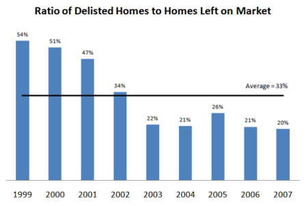
During the period for which I have data – the average ratio of delisted/stayed was 1:3. In other words, sellers were 3 times as likely to stay on the market as they were to pull their listing. However, the average is deceiving. Over the course of the boom, this ratio has fallen steadily: from just over 1:2 in 1999 to the current level of 1:5, where it has been from 2003-07. Sellers psychology during the boom years appears to have shifted to where they have been over twice as likely to “ride it out” than they were previously.
I don’t know what the long term averages are, they could be higher or lower. Either way, it will be interesting to see if this behavior changes significantly as the market slows down.

