One thing I’ll say for the NWMLS, they have been prompt lately about releasing the monthly statistics. Let’s take a look at March, typically the beginning of the strong spring selling season. When the press release with pdf links is released I’ll post it here (though it may be delayed somewhat since I am heading out of town for the weekend). Here is your summary along with the usual graphs and other updates.
Here’s the NWMLS press release: Northwest MLS Brokers Report Stable Prices, “Great Opportunities” for First-time Buyers
Here’s your King County SFH summary:
March 2008
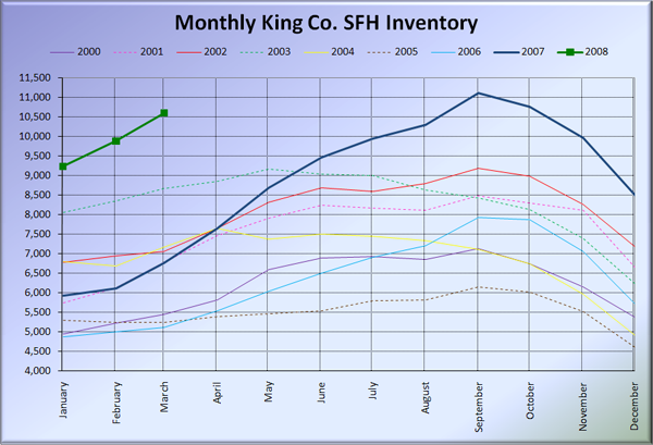
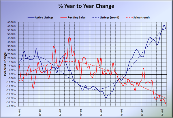
Active Listings: up 57% YOY
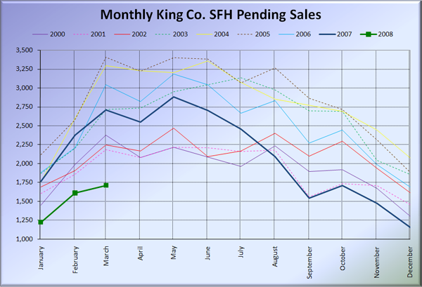
Pending Sales: down 37% YOY (new record)
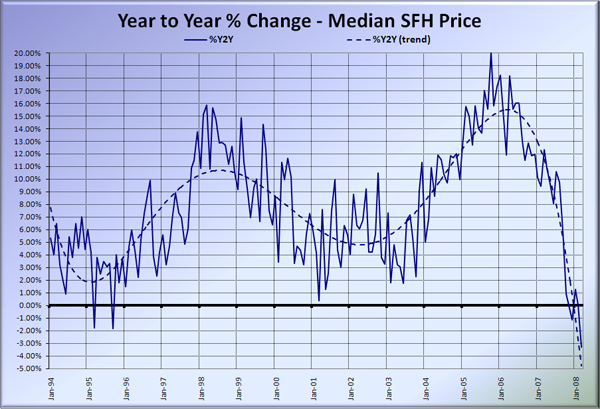
Median Closed Price*: $439,900 – down 3.3% YOY
Here is the updated Seattle Bubble Spreadsheet, and here’s a copy in Excel 2003 format. Click below for the graphs and the rest of the post.
The graph below shows inventory for each year overlaid on the same chart. Wow, we’re shooting right up there, and at this pace will exceed last year’s September peak by April or May. If inventory continues to pile up like this, we could really start to see some serious pressure on sellers to reduce prices.
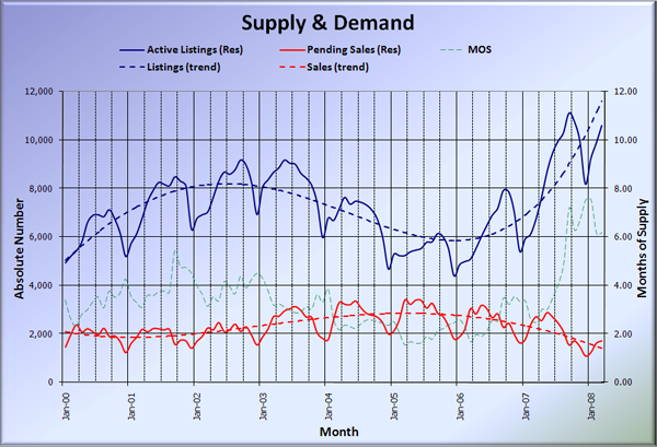
Sales continued to fall through the floor, setting a new record for year-to-year drops. Months of supply (active listings divided by pending sales) stayed essentially the same as February at 6.19. March is now the seventh straight month of MOS above 6 (considered a buyer’s market).
Given how far away the thick green 2008 line is from every other line in both of the above graphs, I think it is quite obvious that the current market is anything but a “normal market.” I bring this up because phrases like “this market is just returning to normal” seem to have become a common refrain among local real estate agents. They are wrong.
Here’s the supply/demand YOY graph. This month I had to adjust the vertical scale on the low end to allow for the disappearing sales. Inventory growth backed off ever so slightly from the top of the graph.
Here’s the chart of supply and demand raw numbers:
Here’s the SFH Median YOY change graph.
Remember last month when J. Lennox Scott said “In March, the real estate market is set to get its mojo back. We’re already seeing the momentum build.”?
I think Mr. Scott must have different definitions of “mojo” and “momentum” than I do.
