In theory, there are two factors that affect the price of homes: supply and demand. We’ve looked extensively at the relationship between supply (inventory) and price in the past. Let’s take a look at the relationship between demand and price.
For the purpose of this post, we will measure demand by looking at the relationship between the number of closed sales in a month and the total population. For population, I’ll be using the “Civilian Labor Force” data from Workforce Explorer Washington, since it is reported monthly. Note that the number I’m using is not the number of people employed, but the total number of employable people. For the median price and total number of closed sales, I’ll be using the single-family home data released monthly by the NWMLS. All of the data will be for King County as a whole.
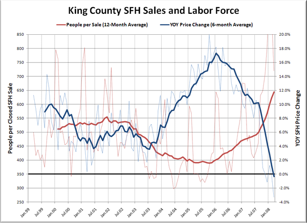
First, let’s have a look at a raw chart of all the data, which is available through early 1999:
In order to keep the graph from being an unintelligible mess, I’ve graphed the “1 Sale per X People” as a 12-month rolling average. This smooths out the large spikes that occur due to the highly seasonal nature of home sales. The YOY price change is also a rolling average, but only 6 months was necessary to smooth it out. You can see the raw data for both series in faint dashed lines.
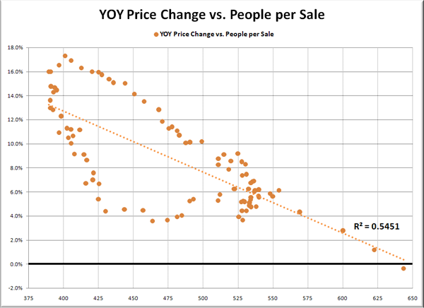
Just by looking at this graph, you can see that there seems to be a relationship between the two—when the number of people per closed sale decreases, the price changes increase, and vice versa. Let’s take a closer look at this by graphing the two running averages on a scatter plot.
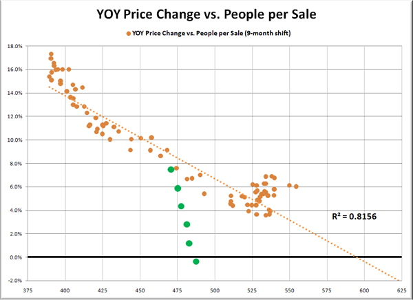
Clearly there’s some sort of relationship going on here, but with an R2 of just over 0.5, it’s not very strong. Let’s take a page out of Deejayoh’s playbook and see what it looks like if we compare each month’s rolling-average sales data with price change data sometime in the future. I looked at 3, 6, 9, and 12-month delays, and found that the strongest relationship was in a 9-month delay:
With an R2 of 0.81, now we’re talking. But what’s with that trail of dots (that I have highlighted in green) deviating so severely from the pattern of all the rest? Those represent the YOY price change data from the last 6 months, October through March. If we stop the series in September, the R2 jumps up to over 0.9.
So clearly there was a strong relationship between demand and home price changes, at least until late last year, when things began to fall apart.
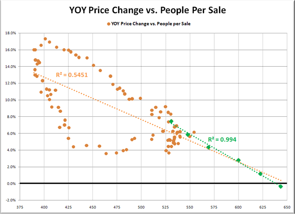
But hold on a minute. Let’s go back to that first scatter plot again. I’ve highlighted the last six data points again in green, and given them their own trend line:
Whoa. Granted, 6 months of data isn’t much to go by, but still, R2 of nearly 1.0 is pretty hard to ignore. I think this is definitely a trend to keep an eye on. If we make the fairly reasonable assumptions that population will continue to grow at the average rate it has grown the last 12 months and YOY sales will continue to drop at the average rate of the last 6 months, this trend line would result in YOY median price drops approaching 20% by the end of 2008.
I am not saying that is what will happen, although it certainly could. I just find it interesting that the time-delay in the relationship between demand and prices seems to have all but vanished with the recent changes in the housing market. Who knows how long it will continue, and who knows what population and sales will really do. What I do know is that I will definitely be paying close attention to this relationship as the mess continues to unfold here in Seattle.
Sources:
Sales & Prices: NWMLS
Labor Force: Workforce Explorer Washington


