Here’s our monthly look at Seattle’s price tiers from Case-Shiller. Remember that Case-Shiller data is based on single-family homes only, no condos or townhomes, and that Case-Shiller’s definition of the “Seattle area” is King, Pierce, and Snohomish counties. For anyone wondering how the tiers are chosen, check out last month’s post.
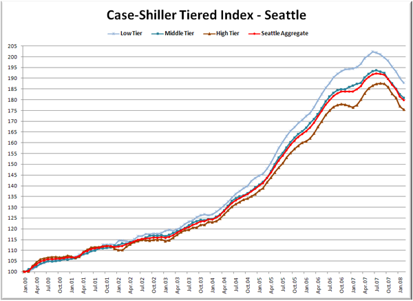
Now here come the graphs. First up is the straight graph of the index from January 2000 through February 2008.
The low tier looks like it’s having the steepest drop from the peak, but the difference is very slight. Right now all three tiers are falling more or less together.
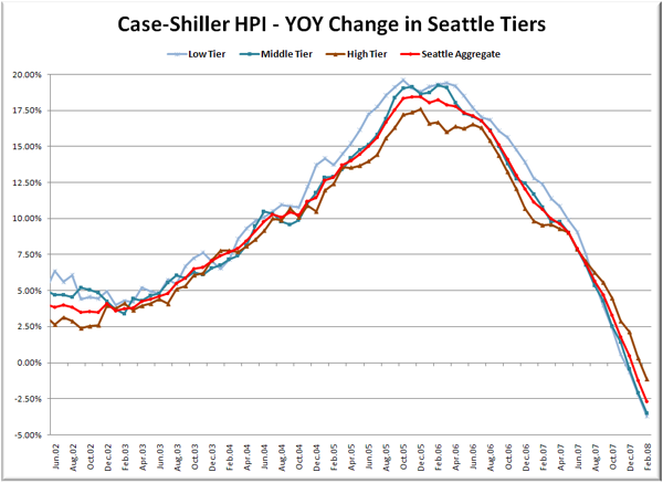
Here’s a chart of the year-over-year change in the index from June 2002 through January 2008 (I selected that date range to match the time-shifted graph in the standard Case-Shiller posts).
Even the high end tier has now dipped into negative YOY territory. Here’s where the YOY price change for the three tiers sit as of February – Low: -3.7%, Med: -3.5%, Hi: -1.1%.
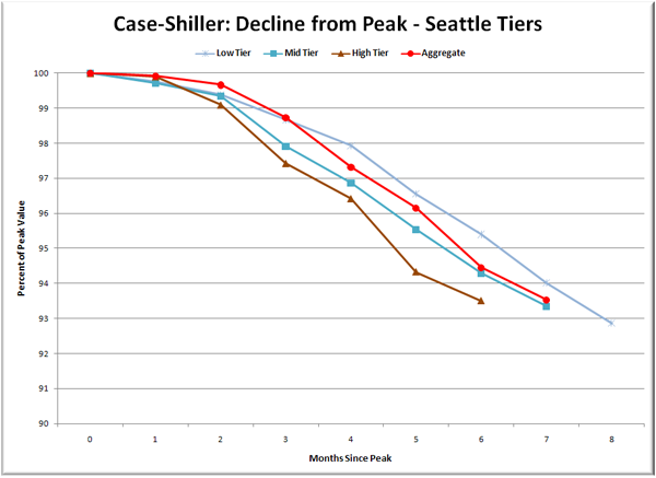
Lastly, here’s a decline-from-peak graph like the one posted yesterday, but looking only at the Seattle tiers.
The drop in all three tapered off a bit last month. As things sit right now, the total decline from peak varies less than 1 percentage point across the three tiers, from a 7.1% drop for the low tier to a 6.5% drop for the high tier.
Not much else to say about this particular set of data. Right now I don’t see any really interesting or unexpected patterns emerging as price declines finally get rolling here in the Pacific Northwest.
(Home Price Indices, Standard & Poor’s, 04.29.2008)


