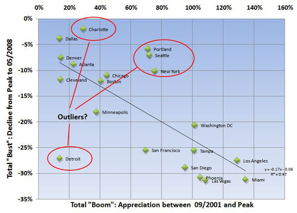
The point has been made many times here that exposure to downturns needs to be viewed in the context of how much a market rose during the boom. I thought it would be interesting to test this by comparing the total percentage gain during the boom years to the total percentage drop from peak to date across a bunch of markets, to see if I could establish a clear relationship or correlation between the two.
For the purposes of this comparison, I used the following definitions:
- “Boom” returns are the total appreciation between 09/2001 (based on the oft cited relationship between the Fed taking down short term lending rates and the housing boom) and the peak for each market.
- “Bust” returns are the total decline from peak to the latest reported numbers.
I used the Case-Shiller report for May as the source of all the numbers. The results are kind of interesting:
This snapshot does appear to support the assertion that there is a good correlation between boom and busts cycles across markets -and that generally speaking, the more you go up, the more you go down. But there appear to be outliers versus the trend: Namely, Detroit on the down side, and Seattle, Portland, Charlotte, and possibly New York on the up side. This is interesting to me because the relationship between up and down markets is usually cited as evidence that the Seattle market will remain relatively stable compared to other markets – when according to this view, we appear to be bucking the trend and perhaps poised for a fall. We are down 7% to date when the trend line suggests we should be off 15-20%
What does it mean? Who knows. There isn’t any hard and fast rule that says every market must follow all other markets, but the inverse relationship between booms and busts does appear to be pretty strong. And it certainly is the case that Seattle has not seen as much “bust” as would be expected when compared to all other markets.
