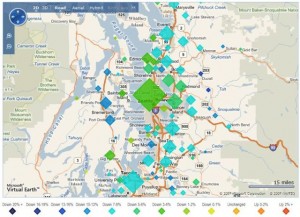
One of the topics discussed frequently on this blog is the notion that prices in the suburbs are likely to fall much further and faster than prices in the urban core of Seattle. Yesterday Zillow posted their quarterly market update data.  I will say that while I’m ambivalent about Zillow’s “Z-estimate” feature, which attempts to predict home values – I find that as source of historical data on market trends at the neighborhood level, the site is an invaluable resource. The mapping feature on the site for the report (which uses this historical data) gives a really nice visual confirmation of the notion of prices falling in commuter zones first.
I pulled this snapshot off the site at a 15 mile granularity. It is almost as if you could draw rings around Seattle and predict the rate of the decline in home prices. No real news here, but I thought it was an interesting visual confirmation of an often discussed concept.