Let’s check out the three price tiers for the Seattle area, as measured by Case-Shiller. Remember, Case-Shiller’s “Seattle” data is based on single-family home repeat sales in King, Pierce, and Snohomish counties.
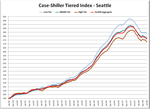
First up is the straight graph of the index from January 2000 through July 2008.
Price drops have resumed in all three tiers. The low tier and mid tiers have rewound to May 2006 with the high tier performing slightly better, back to “just” June 2006. The high tier took the biggest hit in July, falling over two points, or 1.3% in one month.
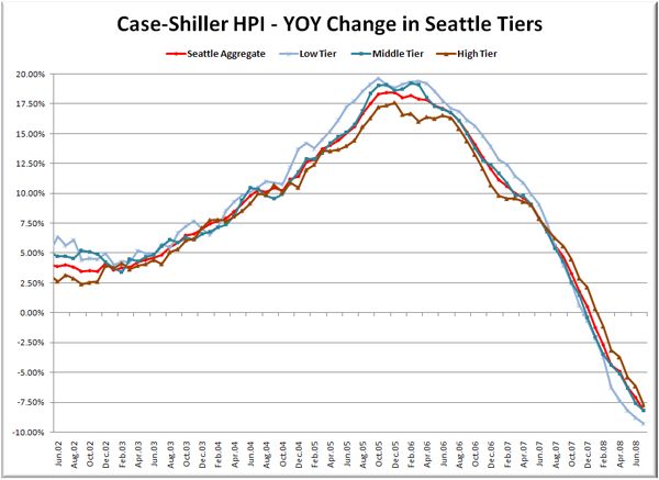
Here’s a chart of the year-over-year change in the index from July 2002 through July 2008.
The low tier is still seeing the biggest drops in terms of YOY performance, falling just over 9% from July 2007. Here’s where the tiers sit YOY as of July – Low: -9.3%, Med: -8.2%, Hi: -7.7%.
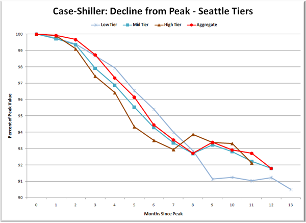
Lastly, here’s a decline-from-peak graph like the one posted yesterday, but looking only at the Seattle tiers.
The high and mid tiers have fallen nearly the same amount, with the low tier resuming its drop after the flat spring “bounce.” The mid tier continues to track pretty closely with the aggregate for the whole Seattle-area market.
I guess spring wasn’t the bottom after all. At this rate, the low tier is likely to drop below 10% from peak as early as next month.
(Home Price Indices, Standard & Poor’s, 09.30.2008)


