Since the stock market is all over the news again today, I thought it would be interesting to look at some past stock crashes and see how the current one compares.
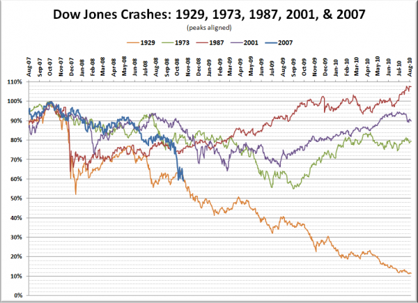
In the chart below I have graphed the crashes of 1929, 1973, 1987, and 2001 alongside the current fall, with the peak points aligned near the left. Each crash is scaled on the y-axis to show the percent of the peak Dow Jones price.
Yesterday’s close was 380 days after the recent 2007 peak in the Dow. Here is the total drop 380 days after peak for each crash above:
1929: 38.6%
1973: 18.3%
1987: 24.2%
2001: 13.6%
2007: 38.6%
Will the current crash play out over the next two years more like 1987 or 1929?
Update: Updated the chart to reflect today’s close. The Dow has now fallen further in the current crash (40.8%) than it did in the same length of time from the peak in 1929 (39.9%).
