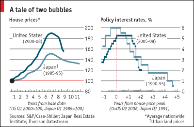
I have been looking for a graphic that accurately compared the Japanese and US housing bubbles for some time. Usually when you see this sort of thing, it compares US housing prices to Japanese land prices – as shown below in a chart clipped from the Economist.

Comparison of US housing and Japanese land prices. Source: The Economist
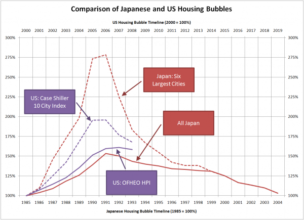
Thanks to Jonness for posting a chart that showed Japanese housing prices, I was able to create a comparative view of the Japanese and US housing bubbles, zero-based to 1984 and 2000, respectively.
I thought the two cycles seem remarkably similar in terms of the duration of the boom and the symmetry of the up/down sides. As to whether or not the US bubble will unwind over a long and painful period like Japan’s, I’m going to leave that to the commentors.
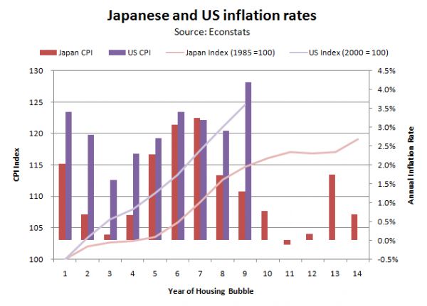
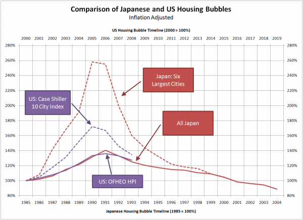
Update: There have been a couple of comments asking about the impact of inflation on the two markets. I did some quick digging around on Econstats and came up with historical CPI figures for the US and Japan. At eight years into the comparative bubble periods, inflation in the US is running about 10 points ahead of Japan, with an index value of 124.6 vs Japan’s 114.6.

As you can see below, this results in a less pronounced “bubble” in the US relative to Japan, and the national level indices track each other almost perfectly

