Let’s check out the three price tiers for the Seattle area, as measured by Case-Shiller. Remember, Case-Shiller’s “Seattle” data is based on single-family home repeat sales in King, Pierce, and Snohomish counties.
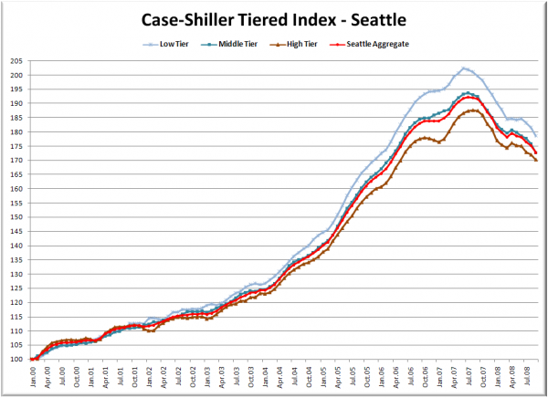
First up is the straight graph of the index from January 2000 through September 2008.
Price drops accelerated slightly in September for all three tiers. The low tier and middle tiers are rewound to just below April 2006 values, while the high tier is just above its May 2006 level. The middle tier again took the biggest percentage hit in September, falling 1.8% in a single month.
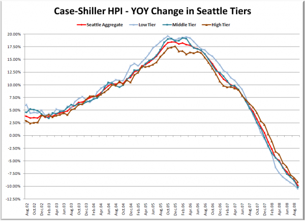
Here’s a chart of the year-over-year change in the index from August 2002 through September 2008.
The low tier had the biggest year-over-year hit, but not by a large margin. Both the low and the middle tiers fell over 10% YOY in September. Here’s where the tiers sit YOY as of September – Low: -10.5%, Med: -10.2%, Hi: -9.2%.
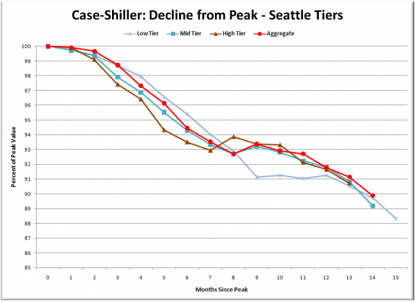
Lastly, here’s a decline-from-peak graph like the one posted yesterday, but looking only at the Seattle tiers.
The decline frome the peak looks remarkably similar across the three tiers since peak +12. This is interesting, since the low tier reached a considerably higher peak than the middle and high tiers, and it would be reasonable to assume that it will correct further. So far we have not seen that happen to a large degree. It will be interesting to see whether the HPI for the three tiers get closer over the next year.
(Home Price Indices, Standard & Poor’s, 11.25.2008)


