I was going back and updating some of my lesser-used spreadsheets today when I came upon one that I thought was particularly interesting. The graph below is an updated version of something I presented originally in the post Home Buying Demand vs. Price Changes back in April.
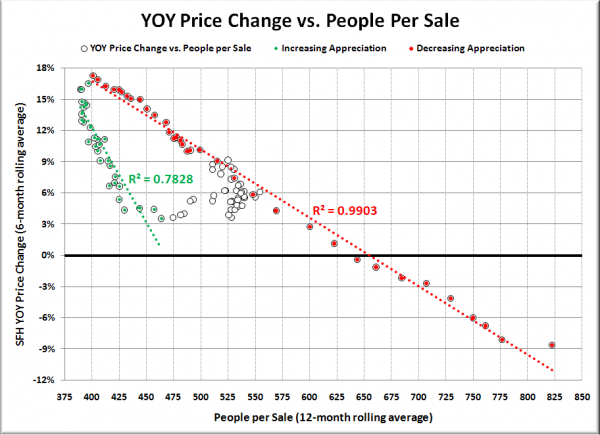
The chart below takes the year-to-year change in the single-family median home price as reported by the NWMLS and compares it to the persons per closed (SFH) sale, using the monthly Civilian Labor Force series from Workforce Explorer. All of the data is for King County as a whole.
The green dots represent the period of increasing home price appreciation from July 2003 through January 2006, while the red dots are the data from January 2006 through November 2008, when home price appreciation has been on the decline. The unfilled white dots represent January 2000 through June 2003, when appreciation was in a state of fluctuation.
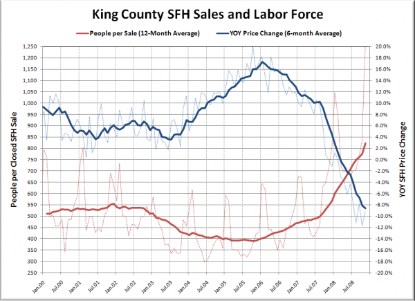
There is no time-shifting in this chart, just the rolling averages to smooth out the noisy data sets. Here’s a plot of the raw data (thin dashed lines) and the rolling averages for each set:
To be honest, I’m not entirely sure what to make of this data. I realize that the last time I posted charts similar to these some folks railed into me (rightly so) for some statistical nonsense in a few of the charts. This time I have attempted to keep things simple, and I think the results are quite interesting.
From what I can tell, there seems to be a very close relationship between the number of sales as a percentage of the population and the change in price. The strange thing to me is how different the slopes are on the red and green lines.
I would postulate that the closely clustered white dots represent the relationship between sales volume and price changes in a “normal” or “balanced” market, while the dramatically-sloped green dots are a result of the out-of-whack mentality of the bubble market, and the red dots are the result of a correcting post-bubble market.
So what do you think? I know there are quite a few readers out there that are more statistically-inclined than myself, and I’d love to have some of you download the data for yourself and give me your take on it.

