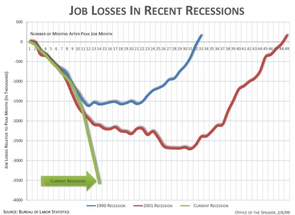
House Speaker Nancy Pelosi recently posted an alarming chart of job losses that has been making the rounds.
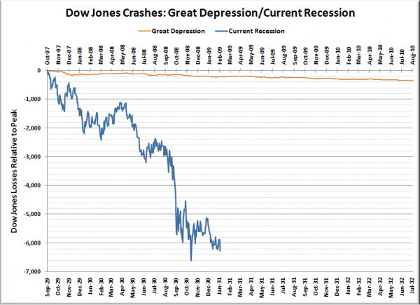
What jumps out to me when I look at her chart is the fact that the y-axis shows raw number of jobs rather than a percentage loss, and therefore fails to account for the increased size of the job pool from one recession to the next. To give you an idea of how misleading this can be, just check out a chart comparing the current Dow Jones crash to the Great Depression, but in raw points rather than as a percentage:
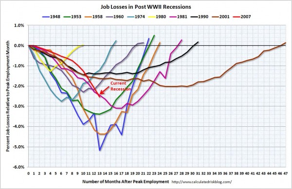
A reader requested that I post a graph similar to the Dow Jones percentage decline crash chart I have published on here a few times, but showing job losses as a percentage loss from the peak. Coincidentally, Calculated Risk posted that exact chart a few days ago. Here it is:
The current rate of job losses is bad, but it doesn’t look quite as alarming when you compare it in a scaled chart.
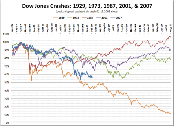
While we’re at it, here’s an updated edition of the Dow Jones crash chart:


