[Note: I apologize again for the tardiness of this regularly-scheduled set of charts. Same story as this month’s Around the Sound update—working on a cool new feature that wasn’t quite ready this month.]
Here’s your look at February’s “Months of Supply” for the 30 NWMLS areas in King County. For an explanation of what months of supply means, please refer to the original neighborhood MOS breakdown post. Also, view a map of these areas here.
February MOS for King County as a whole dipped slightly down to 7.54 (compared to 6.14 for February 2008). The record run of 6+ MOS is now eighteen months. Recall that the previous record was around 6 months in the winter of ’94-’95.
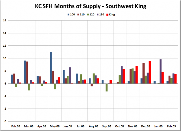
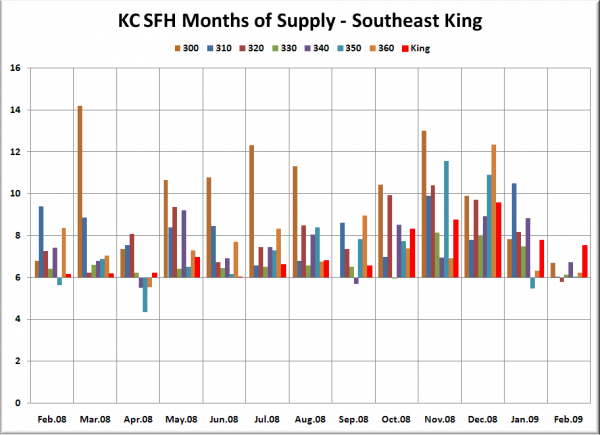
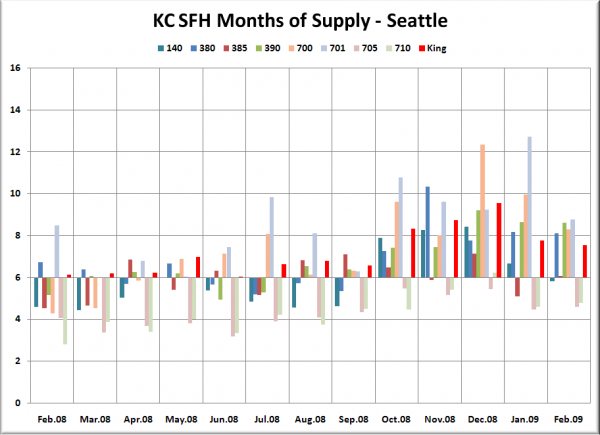
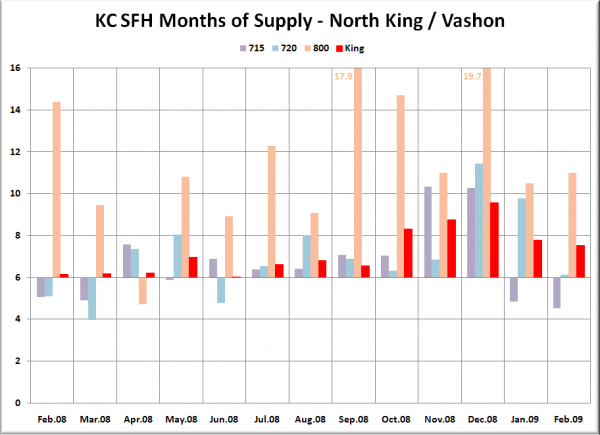
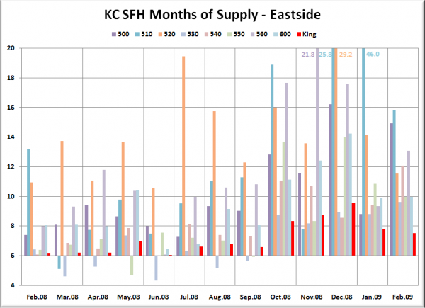
In the graphs below, you’re looking at the MOS for the “Res Only” data from the NWMLS King County Breakout pdfs for the thirteen-month period of February 2008 through February 2009. The bar graph is centered vertically on 6.0 MOS, so that it is easier to visually tell the difference between a seller’s and buyer’s market (i.e. – shorter bars mean a more balanced market). The charts all have the King County aggregate figure plotted in red on the far right.
Note that there are a few areas that appear to have no bar at all for a given month—this represents an MOS value at or close to 6.0. It is also important to remember that whatever the reason, over twenty-five percent of pending sales are not making it to closing, which means that these statistics are likely understating the magnitude of the “buyer’s market.”
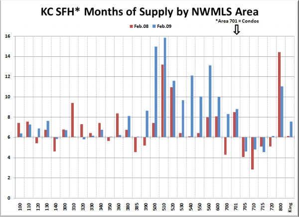
We’ll start off with the chart that lets you directly compare each area’s MOS to its value one year ago. February 2008 is in red, and 2009 is in blue.
Following below are the breakouts for SW King, SE King, Seattle, N King, and the Eastside, as well as a summary of this month’s data.
Note: For Area 701 (Downtown Seattle) we’re using condo data.
February’s month-to-month trend for months of supply was all over the board across King County, with some increasing and some decreasing in a seemingly random fashion. The only apparent pattern in the data was a steep decline in MOS in most of the southeast King neighborhoods. Median prices in all seven of these neighborhoods are comfortably below the county-wide median, so this could be a sign of an uptick in buying activity in the lower price ranges.
Five neighborhoods registered as “sellers’ markets” with under 6.0 MOS in February—West Seattle (140), Black Diamond / Maple Valley (320), Ballard (705), North Seattle (710), and Shoreline (715).
The cumulative MOS for Seattle proper dropped slightly again, but is still in “buyer’s market” territory at 6.2 in January. The Eastside as a whole inched up to 11.5.
Nine of thirty neighborhoods trended more toward a seller’s market than a year ago. Six neighborhoods were above 10 MOS (the same number as last month), firmly in buyer’s market territory.
The three toughest markets for sellers were Mercer Island (510) at 15.8, East Side–South of I-90 (500) at 14.9, and Kirkland–Bridle Trails (560) at 13.1. While not in the top three, 520 extended its 10+ MOS streak, now at 18 months.
The three best markets for sellers as of last month were the same as January: Shoreline (715) at 4.5, Ballard/Greenlake/Greenwood (705) at 4.6, and North Seattle (710) at 4.8.
