It’s time for April market statistics from the NWMLS. Here’s the NWMLS press release: Pending sales in Western Washington rise with improved affordability, buyer incentives
Northwest Multiple Listing Service members reported pending sales for April surged 11.4 percent compared to twelve months ago – and rose 21.3 percent from March.
Brokers reported 6,918 pending sales during April across the 19 counties that make up the Northwest MLS market area. That’s up from the year-ago total of 6,208, and the March figure of 5,701 pending sales (offers made and accepted, but not yet closed).
For the four-county Puget Sound area (King, Kitsap, Pierce and Snohomish), brokers notched 5,372 pending sales, the highest total since August 2007 and a jump of 26 percent from March.
What a shock that their primary focus is on the apparent positive trend in pending sales, when pending sales are rapidly becoming a totally useless measure of actual market activity.
Here’s your King County SFH summary, in a new table format with helpful arrows to show whether the direction of each indicator is positive or negative news for buyers and sellers:
| April 2009 | Number | MOM | YOY | Buyers | Sellers |
| Active Listings | 9,608 | +0.2% | -15.9% |  |
 |
| Closed Sales | 1,004 | +3.7% | -35.3% |   |
  |
| SAAS (?) | 2.86 | +2.7% | +20.3% |   |
  |
| Pending Sales | 2,114 | +25.6% | +14.9% |  |
 |
| Months of Supply | 4.54 | -20.2% | -26.8% |   |
  |
| Median Price* | $380,000 | +4.4% | -15.3% |  |
 |
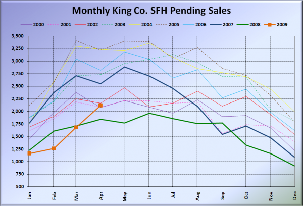
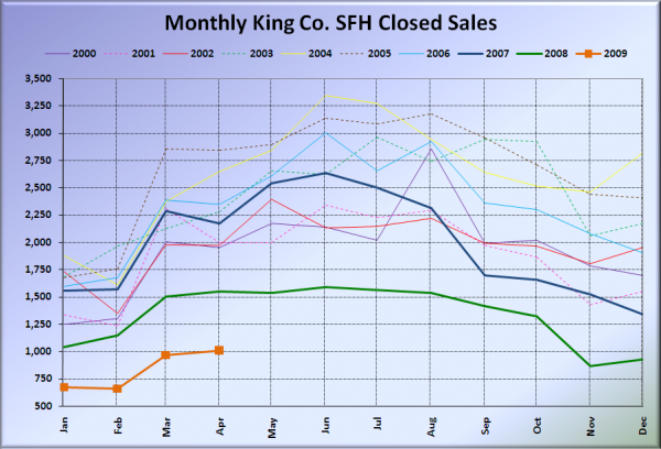
The disconnect between pending sales and closed sales grows ever larger. While pending sales were up 15% from last year, closed sales were down over 30% yet again. Something is becoming extremely fishy about the pending sales data. Observe the stark difference in the two charts below:
The 33% spike from February to March in pending sales resulted in all of a whopping 4% increase in closed sales in the following month. We’ll explore more on this huge disconnect in a little more detail in a future post, but it is good to keep in mind when you start reading news reports in the coming weeks about the market supposedly picking back up. It’s an illusion.
Here is the updated Seattle Bubble Spreadsheet, and here’s a copy in Excel 2003 format. Click below for the graphs and the rest of the post.
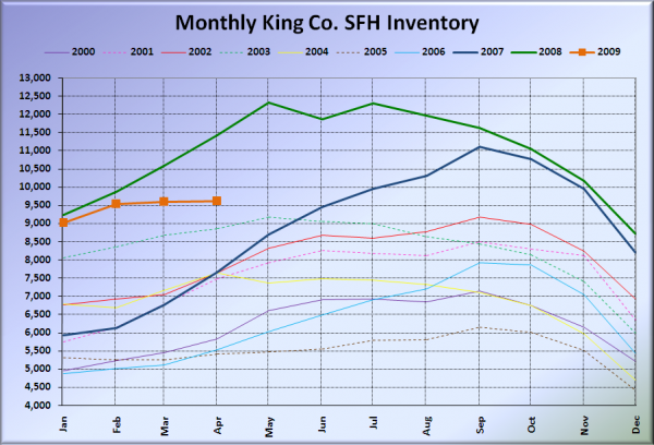
Here’s the graph of inventory with each year overlaid on the same chart.
Inventory stayed mostly flat again in April, which is not surprising. Most people that don’t need to sell are avoiding listing their homes in the current market.
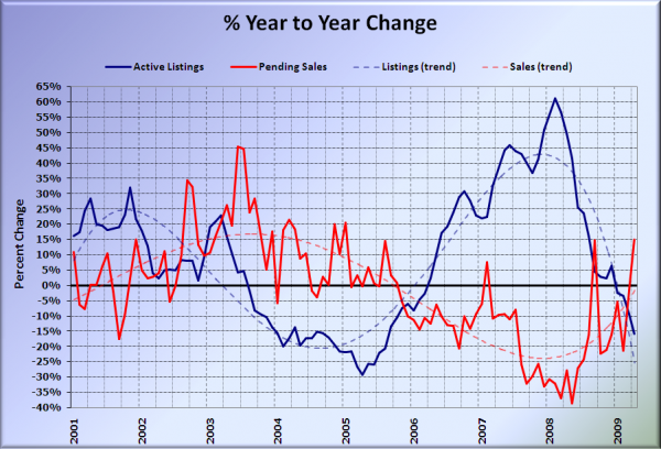
Here’s the supply/demand YOY graph. Keep in mind that “demand” in the next two charts is measured by pending sales, which are becoming increasingly unreliable as a market indicator.
Pending sales jumped sharply back into positive territory in April, while inventory continued its downward trend. No surprises.
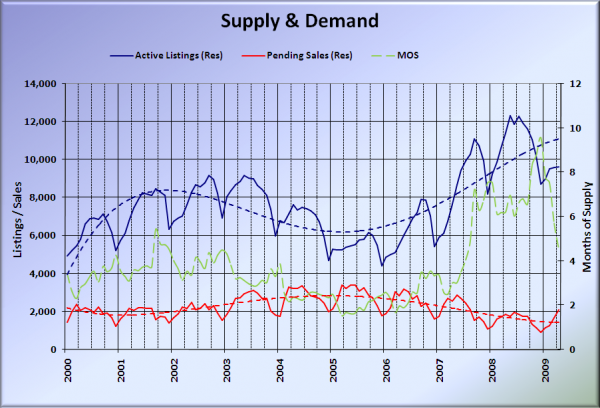
Here’s the chart of supply and demand raw numbers:
April’s pending sales exceeded the peak seen in 2008. Big whoop though, since 30% or more of them will apparently never turn in to actual closed sales.
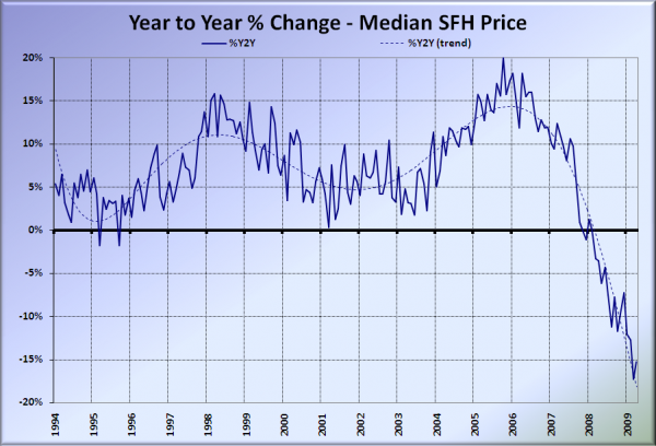
Here’s the median home price YOY change graph:
Despite the nearly $20,000 spike in the median price from last month, the year-over-year change still exceeded negative 15%.
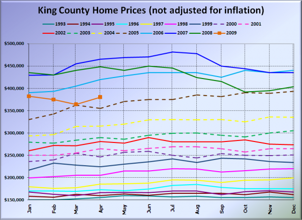
And lastly, here is the chart comparing King County SFH prices each month for every year back to 1994.
April 2009 King County median SFH price: $380,000.
July 2005 King County median SFH price: $375,000.
Our little spring bounce advanced us forward four months in 2005. It will be interesting to see if median prices stay virtually flat through the summer following the bounce, as they did last year.
Looks like we beat the Times and the P-I to the punch on these numbers yet again. I’ll update this post with news blurbs from them when they become available. As usual, check back tomorrow for the full reporting roundup.
[Update]
Seattle Times: Median home prices in King County continue to fall compared to year ago
Seattle P-I: Area home sales sprang up in April
