A commenter on this week’s poll requested a graph of the total monthly dollar volume of all NWMLS-reported closed sales. So, here it is:

Since prices are still higher than 2000-2004, I was actually not expecting this year to show up so low. I also found it interesting how closely 2005, 2006, and the first half of 2007 tracked each other, since the number of sales peaked in 2004, but as sales slowly declined, prices continued to rise.
This number isn’t terribly important to real estate consumers, but you can bet it’s what NWMLS members and state and local governments are paying really close attention to it.
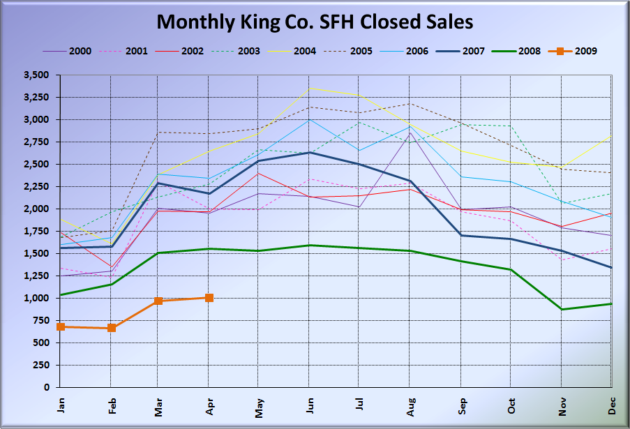
I figured as long as I was playing around with some non-standard charts, I may as well update a few of the charts that I haven’t posted on here in a while.
Here’s one that shows King County median price changes since 2000, with January of each year represented as a horizontal line for reference:

And finally, here’s Seattle’s Case-Shiller HPI, with lines from January 1990 showing compound growth rates of different percentages:

Enjoy.