It’s been nearly two years since we originally detailed how changes in the sales mix affects the median price, and with King County’s SFH median bumping up over $30,000 in the last three months, now seems like a good time for a refresher course.
In brief, the median price is simply the middle point—the home sale which saw half the remaining sales come in at a higher price, and half at a lower price. It is a better measure than the mean (average), since it is not disproportionately affected when a single extremely high or extremely low-priced home is sold.
For example, consider the following over-simplified scenario: Three homes are sold in month A: one for $200,000, one for $350,000, and one for $500,000. The mean and the median are both $350,000. In month B, one home sells for $200,000, one for $350,000, and one for $3,000,000. In month B, the median is still $350,000, but the mean shoots up to $1,183,333, which is obviously not very representative of the market.
Unfortunately, the median has its own shortcomings, they’re just harder to conceptualize. Consider another scenario: City Q has three very distinct neighborhoods. In Neighborhood X, every home sells for $200,000. In Neighborhood Y, every home sells for $350,000. In Neighborhood Z, every home sells for $500,000. In month A, two homes sell in X, two in Y, and two in Z. The median price is $350,000. In month B, only one home sells in X, one in Y, and four in Z. Now the median price is $500,000. Did every house in City Q shoot up in value over 40% in one month? Of course not.
While the actual numbers in the Seattle area are obviously more nuanced than that, we are almost certainly seeing the same effect coming into play with some of the recent fluctuations in the median price.
In order to explore this concept, I have again broken King County down into three regions:
- low end: South County (areas 100-130 & 300-360)
- mid range: Seattle / North County (areas 140, 380-390, & 700-800)
- high end: Eastside (areas 500-600)
Here’s where each region’s median prices came in as of June’s data:
- low end: $229,800—$366,975
- mid range: $301,250—$490,000
- high end: $450,000—$1,175,000
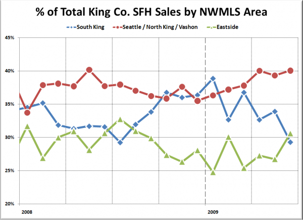
In the following chart I have plotted the percentage of each month’s closed sales that took place in each of the three regions.
The mid-priced region has remained relatively stable over the past year, varying by about 5 percentage points. The high and low-priced regions are a much different story. Just since January, the low-priced region’s share of monthly sales has dropped from 38.9% to 29.3% while the high-priced region has risen from 24.8% to 30.6%.
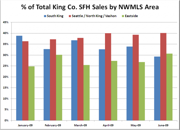
Here’s a close-up of this year’s movement in bar-chart format to better visualize the shift:
This kind of shift will obviously push the median price higher, as it’s essentially just a larger-scale version of the second hypothetical scenario I described above. It goes a long way toward explaining why the median price jumped 4.4% from March to April, but the Case-Shiller index (which uses same-house sale pairs) rose just 0.2%.
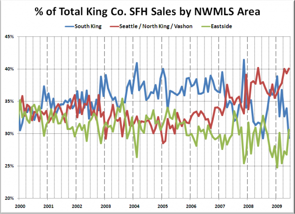
I also find it interesting to look at this same set of data all the way back through 2000:
In the pre-bubble years of 2000 and 2001, the split was nearly even with about one third of the sales taking place in each region. As the bubble really heated up from 2004 through 2006, sales shifted noticeably toward the low-priced south county region, which would seem to indicate that the median was probably understating home price gains throughout much of the bubble years.
In the final full year of Seattle’s housing bubble (2006), here’s how the sales broke down:
- low end: 37.3%
- mid range: 32.8%
- high end: 29.9%
And here’s where it sits as of June 2009:
- low end: 29.3% (down 8.0 points)
- mid range: 40.1% (up 7.3 points)
- high end: 30.6% (up 0.7 points)
As the sales distribution continues to shift away from the low-priced areas and into the mid and high-priced regions, we will likely continue to see some hidden skewing in the median.


