Let’s make our regularly scheduled monthly check on the Case-Shiller Home Price Index. According to June data,
Up 0.4% May to June.
Down 0.3% May to June (seasonally adjusted)
Down 16.1% YOY.
Down 22.2% from the July 2007 peak
Last year prices fell 0.2% from May to June (not seasonally adjusted) and year-over-year prices were down 7.1%.
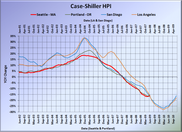
Here’s the usual graph, with L.A. & San Diego offset from Seattle & Portland by 17 months. Everybody’s getting some of the reduced rate of losses action, with Portland rising to -15.2%, Los Angeles at -17.8%, and San Diego at -16.0%. Note – Seattle: -16.1%, San Diego -16.0%. Hmm.
Note: This graph is not intended to be predictive. It is for entertainment purposes only.
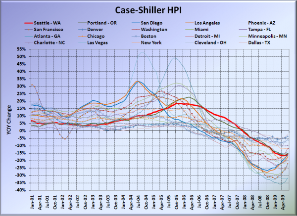
Here’s the graph of all twenty Case-Shiller-tracked cities:
In June, ten of the twenty Case-Shiller-tracked cities experienced smaller year-over-year drops than Seattle (vs. nine last month). Dallas at -2.2%, Cleveland at -3.0%, Denver at -3.6%, Boston at -5.9%, Charlotte at -9.7%, Washington, DC at -11.7%, New York at -11.7%, Atlanta at -14.0%, Portland at -15.2%, and San Diego at -16.0%. Vegas pushed Phoenix out of the #1 spot for the largest year-over-year drop, as prices fell 32.3% in a single year.
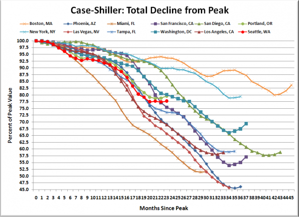
Here’s an update to the peak-decline graph, inspired by a graph created by reader CrystalBall. This chart takes the twelve cities whose peak index was greater than 175, and tracks how far they have fallen so far from their peak. The horizontal axis shows the total number of months since each individual city peaked.
In the twenty-two months since the price peak in Seattle prices have declined 22.2%. Still looks like more or less a flatline since March, putting Seattle slightly above San Francisco’s line, but slightly below Washington, DC.
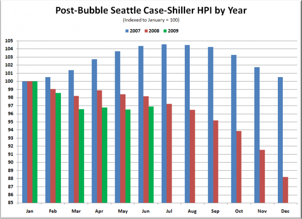
The following chart takes the post-bubble years of 2007, 2008, and 2009 and indexes each January’s Case-Shiller HPI to 100 so we can get a picture of how this year’s declines compare to last year:
Still tracking below 2008 compared to January, but performing slightly better than 2008 from March to June.
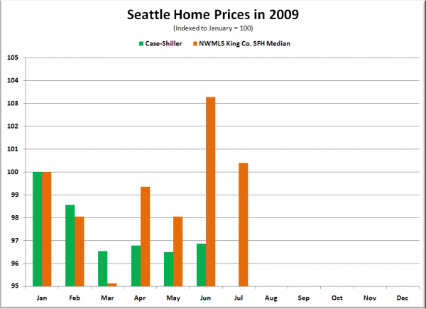
Here’s one more chart, for the folks that think that Case-Shiller is useless because it is somehow equivilent to the NWMLS data, but on a 2-month delay. The following chart shows 2009 home prices, indexed to January = 100, as reported by the NWMLS and by Case-Shiller.
The dramatic swing in the NWMLS data from down nearly 5% in March to up over 3% in June that had some people shouting about a bottom in home prices is non-existent in the Case-Shiller data. NWMLS March to June: +8.6% ($31,150). Case-Shiller March to June: +0.3%. This stark difference can most likely be attributed to a shifting geographic and sale tier mix, and is an excellent example of why the Case-Shiller data provides us a better picture of what’s really going on with home prices in the last few months.
Check back tomorrow for a post on the Case-Shiller data for Seattle’s price tiers.
(Home Price Indices, Standard & Poor’s, 08.25.2009)
