What better way to kick off Thanksgiving weekend than with the latest data from the Case-Shiller Home Price Index? According to September data,
Down 0.4% August to September.
Down 0.3% August to September (seasonally adjusted)
Down 13.8% YOY.
Down 22.5% from the July 2007 peak
Last year prices fell 1.4% from August to September (not seasonally adjusted) and year-over-year prices were down 9.8%.
Unfortunately it would appear that S&P has put an unpaid intern on website duty, because in addition to misspelling Robert Shiller’s name in the title of the page, it is not being updated in a timely fashion with the latest spreadsheets, so I don’t have the seasonally-adjusted data yet. I will update this post when it is available.
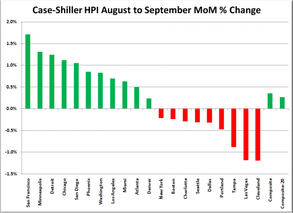
Update: Looks like they got things sorted out (except for the misspelling). Here’s the seasonally-adjusted month-over-month chart:
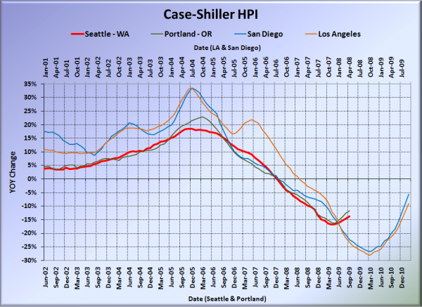
Here’s our offset graph, with L.A. & San Diego time-shifted from Seattle & Portland by 17 months. SoCal’s year-over-year continues to rocket back up to zero. Portland came in at -11.8%, and both Los Angeles at -9.0%, and San Diego at -5.7% continue to come in better than Seattle.
Note: This graph is not intended to be predictive. It is for entertainment purposes only.
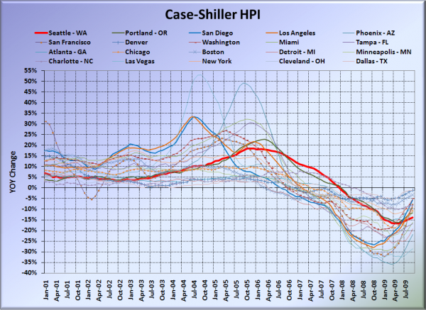
Here’s the graph of all twenty Case-Shiller-tracked cities:
In September, fourteen of the twenty Case-Shiller-tracked cities experienced smaller year-over-year drops than Seattle (same as August). Denver at -1.2%, Dallas at -1.2%, Boston at -3.3%, Cleveland at -3.7%, Washington, DC at -5.0%, San Diego at -5.7%, San Francisco at -7.8, Charlotte at -8.1%, Los Angeles at -9.0%, New York at -9.0%, Atlanta at -9.3%, Chicago at -10.6%, Minneapolis at -11.2%, and Portland at -11.8%. Vegas took the #1 spot again for the largest year-over-year drop, but dropped back under 30%, falling “just” 28.6% in the year.
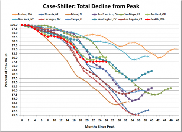
Here’s an update to the peak-decline graph, inspired by a graph created by reader CrystalBall. This chart takes the twelve cities whose peak index was greater than 175, and tracks how far they have fallen so far from their peak. The horizontal axis shows the total number of months since each individual city peaked.
In the twenty-six months since the price peak in Seattle prices have declined 22.5%.
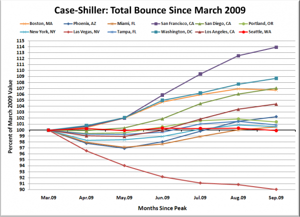
Here’s a complementary chart to that last one. This one shows the total change in the index since March for the same twelve markets as the peak decline chart.
Whoops, Seattle dropped back below zero on that one.
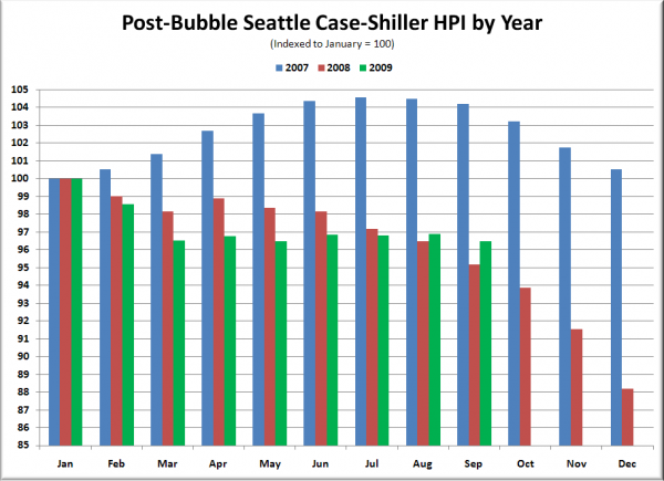
The following chart takes the post-bubble years of 2007, 2008, and 2009 and indexes each January’s Case-Shiller HPI to 100 so we can get a picture of how this year’s declines compare to last year:
Still pulled into better territory than last year. However, with the normal seasonal drop in priced dead ahead, and the mad rush to beat the tax credit deadline no longer a factor, we may well see prices decline around 10% for the year by the time we get December’s data.
Check back tomorrow for a post on the Case-Shiller data for Seattle’s price tiers.
(Home Price Indices, Standard & Poor’s, 11.24.2009)
