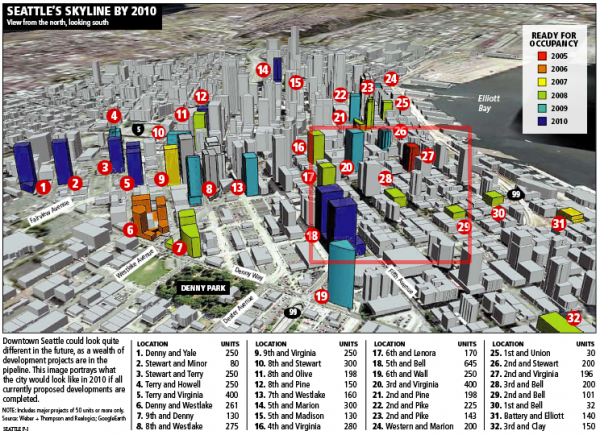
Here’s an interesting comparison. First, this graphic, posted here in June 2006, from a Seattle P-I article titled Booming development set to change Seattle’s look:
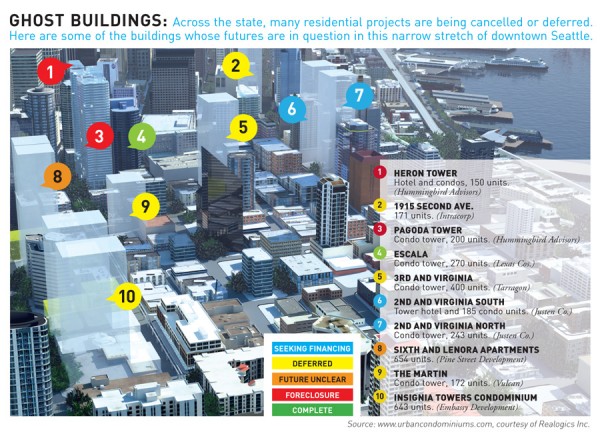
Then, a similar graphic from the most recent Seattle Business Magazine. The red rectangle on the first graphic shows the area that the second graphic covers.
I guess Seattle wasn’t all that “under-condo’ed” after all. Who knew.
Hat tip: Urbnlivn

