December market stats have been published by the NWMLS. Here’s the NWMLS press release: Western Washington pending home sales mark best December since 2006. Hard to believe they’re still crowing about pending sales.
Here’s your King County SFH summary, with the arrows to show whether the year-over-year direction of each indicator is favorable or unfavorable news for buyers and sellers (green = favorable, red = unfavorable):
| December 2009 | Number | MOM | YOY | Buyers | Sellers |
| Active Listings | 6,918 | -15.8% | -20.5% |  |
 |
| Closed Sales | 1,462 | -7.1% | +57.4% | |
|
| SAAS (?) | 1.99 | +34.5% | -36.5% | |
|
| Pending Sales | 1,413 | -10.6% | +55.1% | |
|
| Months of Supply | 4.9 | -5.8% | -48.8% | |
|
| Median Price* | $380,000 | +2.7% | -5.8% | |
|
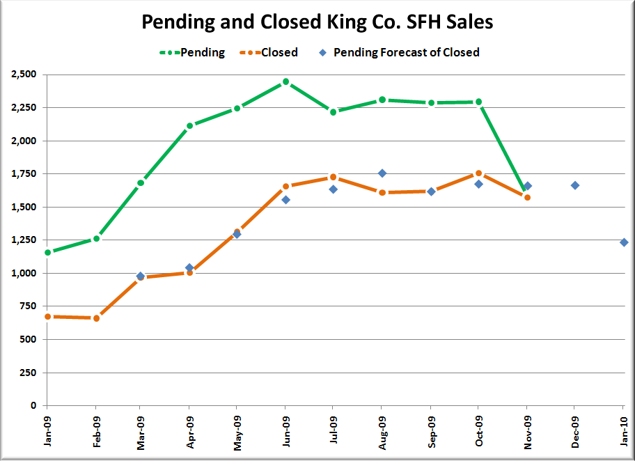
Interestingly, last month’s pending / closed chart predicted around 1,650 closed sales for December, but the actual number came in about 10% lower than that.
Between 2000 and 2008 closed sales actually increased an average of 1.85% from November to December. With future sales having been borrowed by the tax credit and shifted into this summer and fall it is not too surprising to see a month-to-month drop instead this year as we head into winter.
Feel free to download the updated Seattle Bubble Spreadsheet, and here’s a copy in Excel 2003 format. Click below for the rest of the usual monthly graphs.
Here’s how the closed sales situation is shaping up compared to previous years:

More closed sales in December 2009 than 2008 or 2007, but less than every other year on record.
Click below for the rest of this month’s graphs…
Here’s the graph of inventory with each year overlaid on the same chart.

The inventory in the last three months of this year actually ended up following very closely with 2002.
Here’s the supply/demand YOY graph. In place of the now-unreliable measure of pending sales, the “demand” in the following two charts is now represented by closed sales, which have had a consistent definition throughout the decade.

Here’s the chart of supply and demand raw numbers:

Even after the tax credit boost, 2009 was still a pretty anemic year for home buying demand.
Here’s the median home price YOY change graph:

And lastly, here is the chart comparing King County SFH prices each month for every year back to 1994.

2009 is the year of the bobbing median price apparently.
Here’s a few news blurbs to hold you over until tomorrow’s reporting roundup.
Seattle Times: King County home sales surge in December for seventh straight month
Seattle P-I: Seattle-area home sales remain strong, report says