Since we frequently pull our home price data from a variety of sources, once in a while I like to bring them all together for a comparison.
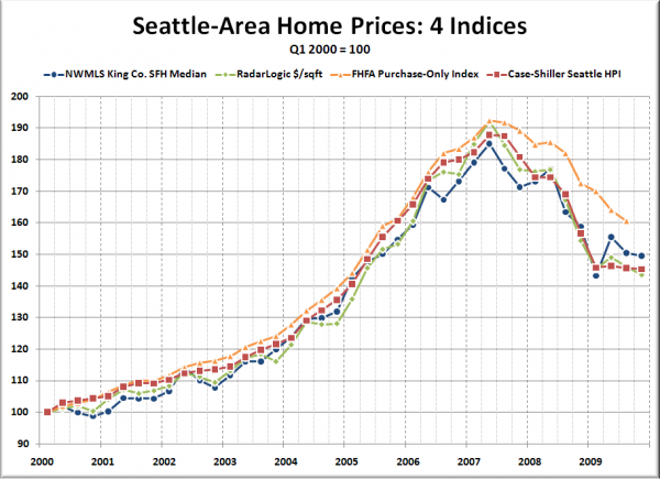
Here’s a look at the NWMLS King County SFH median, Radar Logic‘s price per square foot, the FHFA purchase-only index, and Case Shiller‘s home price index. Each measure has been indexed to Q1 2000 = 100 for easier comparison:
As of the latest data (Q4 2009 for all but the FHFA index), the four indices are off between -16.5% and -25.2% from their Q2 2007 peaks. The price per square foot, FHFA, and Case-Shiller index all hit their lowest post-peak values in their latest data, while the raw median is up 4% from the Q1 2009 low.
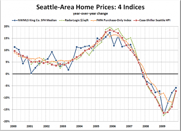
Here’s a look at the year-over-year change in the four indices over the same time period:
I’m pretty sure that the recent divergence of the FHFA data from the other indices is due to the fact that it is based only on Fannie & Freddie-insured mortgages, which excludes jumbo loans (a relatively large percentage of the Seattle market, at least until the bubble burst).
Another fun dataset to play around with is Zillow’s “Local Info” pages, which lets you break the data down by city and compare multiple cities on the same chart, plus you can view other interesting data, like the percentage of homes sold for a loss.

