Let’s have a look at the latest data from the Case-Shiller Home Price Index. According to January data,
Down 1.7% December to January.
Down 0.6% December to January (seasonally adjusted).
Down 6.0% YOY.
Down 24.5% from the July 2007 peak
Last year prices fell 3.6% from December to January (not seasonally adjusted) and year-over-year prices were down 15.0%.
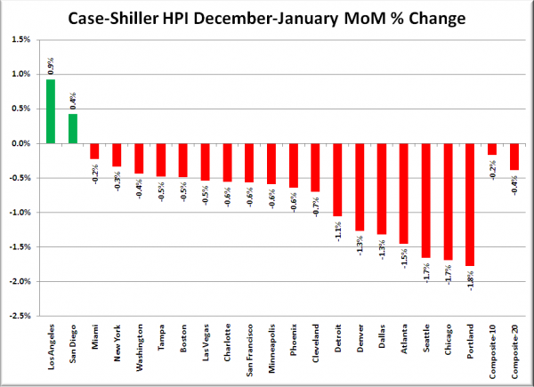
As has been the case each of the last five months (at least), Bloomberg is running a grossly misleading headline and leader. Their article headline is Home Prices in 20 U.S. Cities Increased 0.3% in January, and the first paragraph is “Home prices in 20 U.S. cities unexpectedly rose in January, indicating the housing market is stabilizing as the economy expands.” For reference, here is what Bloomberg’s “home prices in 20 U.S. cities increasing” looks like:
I still think it’s a huge stretch to state “home prices rise” when you’re talking about the black-box seasonally-adjusted index, plus the blanket statement that prices rose “in 20 U.S. cities” is just flat-out false. In reality, home prices fell in eighteen out of twenty Case-Shiller-tracked cities from December to January.
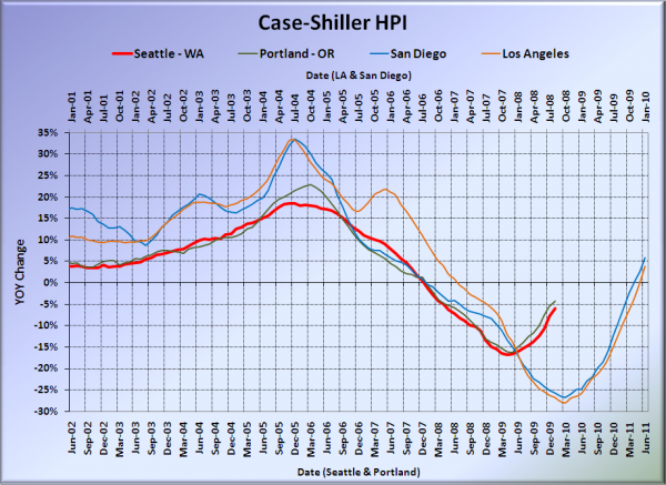
Here’s our offset graph, with L.A. & San Diego time-shifted from Seattle & Portland by 17 months. San Diego and LA continue to show slight YOY gains. Portland came in at -4.2%, Los Angeles at +3.9%, and San Diego at +5.9%, all better than Seattle again.
Note: This graph is not intended to be predictive. It is for entertainment purposes only.
Here’s an interactive graph of all twenty Case-Shiller-tracked cities, courtesy of Tableau Software (check and un-check the boxes on the right):
Nine of thirty Case-Shiller-tracked cities are now in positive YOY territory: Los Angeles, San Diego, San Francisco, Denver, Washington DC, Boston, Minneapolis, Cleveland, and Dallas.
In January, fifteen of the twenty Case-Shiller-tracked cities experienced smaller year-over-year drops (or saw year-over-year increases) than Seattle (one more than August through December). San Francisco at +9.0, San Diego at +5.9%, Dallas at +4.2%, Los Angeles at +3.9%, Washington, DC at +3.5%, Denver at +2.7%, Minneapolis at +1.9%, Boston at +1.5%, Cleveland at +0.2%, Atlanta at -2.2%, Charlotte at -3.2%, Portland at -4.2%, Chicago at -4.4%, Phoenix at -4.5%, and New York at -5.3%.
The only other cities still experiencing larger year-over-year declines than Seattle are Miami, Tampa, Detroit, and Las Vegas.
Here’s an interactive chart of the raw HPI for all twenty cities through January.
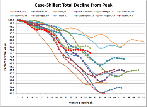
Here’s an update to the peak-decline graph, inspired by a graph created by reader CrystalBall. This chart takes the twelve cities whose peak index was greater than 175, and tracks how far they have fallen so far from their peak. The horizontal axis shows the total number of months since each individual city peaked.
In the twenty-eight months since the price peak in Seattle prices have declined 24.5%, yet another new post-peak low, and a fairly decisive drop from the plateau around 22.5% off the peak where things had stabilized for most of 2009.
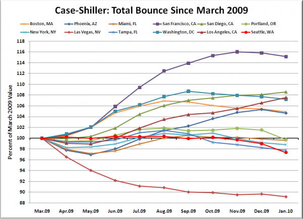
Here’s a complementary chart to that last one. This one shows the total change in the index since last March for the same twelve markets as the peak decline chart.
Uh-oh, looks like the bounce may be running out of steam as the free money tax credit giveaway begins to wind down…
Check back tomorrow for a post on the Case-Shiller data for Seattle’s price tiers.
(Home Price Indices, Standard & Poor’s, 03.30.2010)


