Let’s have a look at the latest data from the Case-Shiller Home Price Index. According to February data,
Down 1.1% January to February.
Down 5.6% YOY.
Down 25.3% from the July 2007 peak
Last year prices fell 1.5% from January to February and year-over-year prices were down 15.4%.
Hilariously, Bloomberg continues to run a headline on the Case-Shiller data that implies that home prices rose in all twenty cities tracked by the index. From Home Prices in U.S. Cities Rise Less Than Forecast:
April 27 (Bloomberg) — Home prices in 20 U.S. cities rose less than forecast in February from a year earlier, a sign a housing recovery will take time to develop.
The S&P/Case-Shiller home-price index of property values in 20 cities increased 0.6 percent from February 2009, the first gain since December 2006, the group said today in New York. The median forecast of economists surveyed by Bloomberg News projected a 1.3 percent advance.
See, what they did there was to suddenly switch which data point they are talking about. In all their stories for the last six months or so, they have been focusing in on the month-to-month change in the seasonally-adjusted value of the 20-city index. But this month, the 20-city index fell month-to-month, even if you use the semi-bogus seasonally-adjusted data (more on that below). Hey, no problem! Just find a different data point that suits the narrative of “home prices rise.” So all of a sudden, they switched to reporting the year-over-year change in the 20-city index. Classy.
Oh, and by the way, even when we look at the year-over-year comparison, it is still inaccurate to say that “home prices in 20 U.S. cities rose.” Prices are up year-over-year in nine cities, and down year-over-year in the other eleven.
I bring this up to point out the reason that I do my best to remain consistent in which data points we discuss on Seattle Bubble each month. When “journalists” pick and choose whichever data is convenient for the story they want to tell, it is difficult for the readers to really understand what is going on.
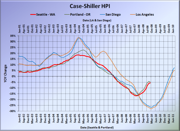
So, here’s our offset graph—the same graph we post every month—with L.A. & San Diego time-shifted from Seattle & Portland by 17 months. San Diego and LA have added to their YOY gains. Portland slipped slightly, and the rate of increase in Seattle’s YOY change has definitely stalled. Portland came in at -4.8%, Los Angeles at +5.3%, and San Diego at +7.6%, still all better than Seattle.
Note: This graph is not intended to be predictive. It is for entertainment purposes only.
Here’s an interactive graph of all twenty Case-Shiller-tracked cities, courtesy of Tableau Software (check and un-check the boxes on the right):
Nine of thirty Case-Shiller-tracked cities are now in positive YOY territory: Los Angeles, San Diego, San Francisco, Denver, Washington DC, Boston, Minneapolis, Cleveland, and Dallas.
In February, seventeen of the twenty Case-Shiller-tracked cities experienced smaller year-over-year drops (or saw year-over-year increases) than Seattle (two more than January). San Francisco at +11.9, San Diego at +7.6%, Los Angeles at +5.3%, Washington, DC at +5.0%, Denver at +3.6%, Cleveland at +3.2%, Minneapolis at +3.0%, Dallas at +2.3%, Boston at +1.8%, Atlanta at -0.9%, Phoenix at -1.6%, Charlotte at -2.5%, Chicago at -3.0%, New York at -4.1%, Miami at -4.4%, Portland at -4.8%, and Detroit at -5.4%.
Only two cities still have home prices falling faster year-over-year than Seattle: Tampa, and Las Vegas. Even Detroit is falling slower now. Ouch.
Here’s an interactive chart of the raw HPI for all twenty cities through February.
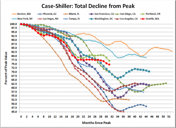
Here’s an update to the peak-decline graph, inspired by a graph created by reader CrystalBall. This chart takes the twelve cities whose peak index was greater than 175, and tracks how far they have fallen so far from their peak. The horizontal axis shows the total number of months since each individual city peaked.
In the thirty-one months since the price peak in Seattle prices have declined 25.3%, yet another new post-peak low.
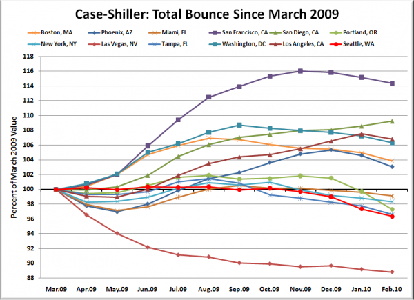
Here’s a complementary chart to that last one. This one shows the total change in the index since last March for the same twelve markets as the peak decline chart.
Hmm, only San Diego seems to still be experiencing the tax credit high.
Lastly, I thought it would also be worth pointing out a little tidbit that came out earlier this week from S&P. I have avoided using the seasonally-adjusted data in most of my posts on the Case-Shiller releases, because it has always struck me as somewhat arbitrary. As it turns out, the data analysts over at S&P are starting to feel the same way (pdf, via Calculated Risk):
For the S&P/Case-Shiller Home Price Indices, S&P reports two data sets – before seasonal adjustment and seasonally-adjusted. In some recent reports the two series have given conflicting signals, with the seasonally-adjusted series rising month-over-month and the unadjusted series declining. After reviewing the data, the S&P/Case-Shiller Home Price Index Committee believes that, for the present, the unadjusted series is a more reliable indicator and, thus, reports should focus on the year-over-year changes where seasonal shifts are not a factor. Additionally, if monthly changes are considered, the unadjusted series should be used.
Obviously, we will continue to build our charts on the unadjusted data.
Check back tomorrow for a post on the Case-Shiller data for Seattle’s price tiers.
(Home Price Indices, Standard & Poor’s, 04.27.2010)


