A few days ago on my sarcastic interest rates post, Dave0 asked:
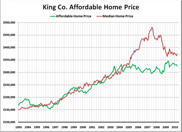
I wonder what the chart would look like if you graphed out, from 2000 to present, the price someone could afford to buy with the given interest rate at the time (from the graph above), with payments equal to 28% of the median household income at the time. How closely would that correlate to the median price graph? Tim is this something you could pull together?
I can’t resist a request for a new chart, so here you go:
The results probably won’t be too surprising to anyone who has been following the housing bubble for some time. The whole reason that it was a bubble was because home prices got way out of whack with the fundamentals.
Note that the blue dot on the median price line in the above chart indicates the month that I launched Seattle Bubble, saying that “I do believe there is a speculative bubble in real estate right now.”
While we were making good progress toward a complete correction in home prices from 2007 through early 2009, last year’s massive government intervention seems to have delayed the full return to rational pricing by a bit. The last point on the “Affordable Home Price” line is at $325,000, while the most recent median price was $375,000.
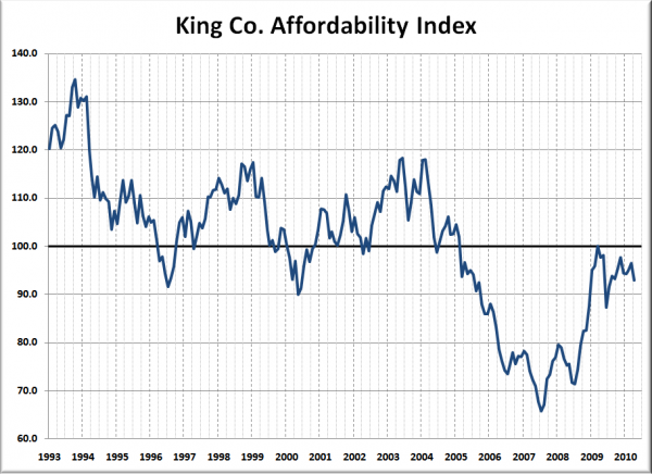
As a complement to the above chart, here’s an updated look at the affordability index for King County:
We just barely touched 100.0 on the index in March of last year before all of the government “assistance” drove home prices back into more unaffordable territory.

