Let’s check out the three price tiers for the Seattle area, as measured by Case-Shiller. Remember, Case-Shiller’s “Seattle” data is based on single-family home repeat sales in King, Pierce, and Snohomish counties.
Note that the tiers are determined by sale volume. In other words, 1/3 of all sales fall into each tier. For more details on the tier methodologies, hit the full methodology pdf. Here are the current tier breakpoints:
- Low Tier: < $263,258 (up 0.3%)
- Mid Tier: $262,524 – $402,831
- Hi Tier: > $402,831 (up 0.4%)
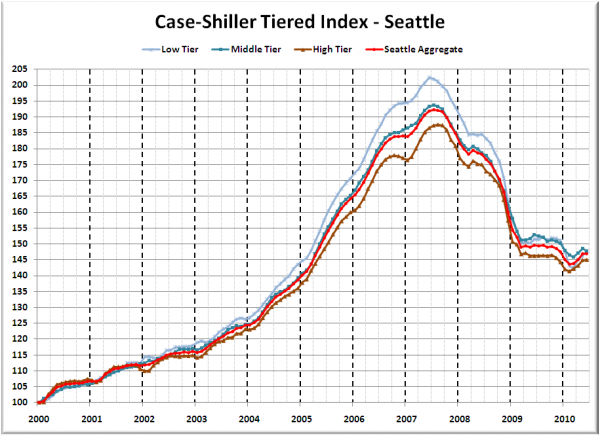
First up is the straight graph of the index from January 2000 through June 2010.
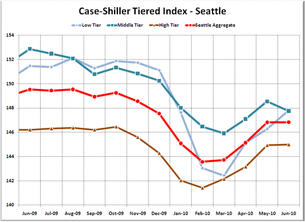
Here’s a zoom-in, showing just the last year:
Not too surprisingly, the low tier seems to have been the only one to benefit from the expiring tax credit. While the low tier rose 1.0% MOM, the middle tier fell 0.5%, and the high tier was flat.
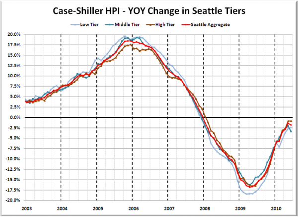
Here’s a chart of the year-over-year change in the index from January 2003 through June 2010.
The low and high tiers marked slight improvement in their respective YOY numbers, but the middle tier declined notably. Here’s where the tiers sit YOY as of June – Low: -2.4%, Med: -3.4%, Hi: -0.8%.
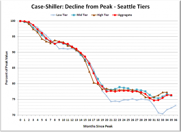
Lastly, here’s a decline-from-peak graph like the one posted yesterday, but looking only at the Seattle tiers.
Looks like the low tier is making up a little bit of ground lately.
(Home Price Indices, Standard & Poor’s, 08.31.2010)


