August market stats have been published by the NWMLS on Friday. It’s rather unusual that they would release the stats so early in the month, but maybe they figured since the cat is out of the bag on their bogus methodology already anyway, they would go ahead and push the report out as early as possible. Here’s what they have to say about their numbers: "Value-Hunters" seizing opportunities to buy more affordable homes around Western and Central Washington.
Value is what’s selling in the current housing market, according to members of Northwest Multiple Listing Service. Commenting on the MLS report summarizing August activity, directors agree conditions continue to favor buyers, although one industry official cautioned a looming change in mortgage insurance premiums could erode purchasing power.
See? They’re on the buyer’s side! They just want you to get in there and get a good deal before interest rates shoot to the moon!
Read the rest of their post if you want some more delicious nuggets of nonsense fear-mongering. Read the rest of this post if you want to look at their nonsense data.
NWMLS monthly reports include an undisclosed and varying number of
sales from previous months in their pending and closed sales statistics.
Here’s your King County SFH summary, with the arrows to show whether the year-over-year direction of each indicator is favorable or unfavorable news for buyers and sellers (green = favorable, red = unfavorable):
| August 2010 | Number | MOM | YOY | Buyers | Sellers |
|---|---|---|---|---|---|
| Active Listings | 10,390 | -0.8% | +9.5% |  |
 |
| Closed Sales | 1,313 | -10.9% | -18.4% |  |
 |
| SAAS (?) | 2.25 | -2.3% | +17.3% |  |
 |
| Pending Sales | 1,716 | -4.9% | -22.6% |  |
 |
| Months of Supply | 5.85 | -4.1% | +42.4% |  |
 |
| Median Price* | $380,000 | -5.0% | +1.3% |  |
 |
Feel free to download the updated Seattle Bubble Spreadsheet (Excel 2003 format), but keep in mind the caution above.
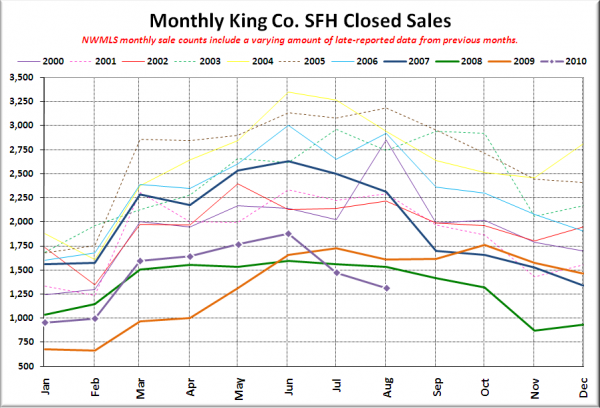
Here’s your closed sales yearly comparison chart:
Closed sales may have actually inched up a bit from July to August, but the screwy method of including late-reported sales in the wrong month that the NWMLS uses means we don’t get to see that.
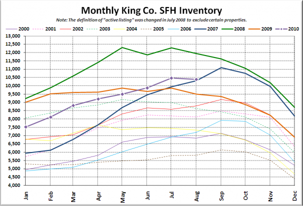
Here’s the graph of inventory with each year overlaid on the same chart.
It’s not looking good for breaking 11,000 this year.
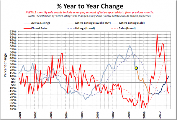
Here’s the supply/demand YOY graph. In place of the now-unreliable measure of pending sales, the “demand” in this chart is represented by closed sales, which have had a consistent definition throughout the decade.
Still trending toward another strong buyer’s market.
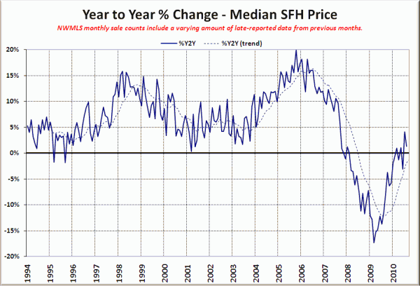
Here’s the median home price YOY change graph:
Nothing too surprising here. I expect we’ll see slightly positive YOY readings on the median price for a while as the sales mix continues to recover from the tax credit hangover.
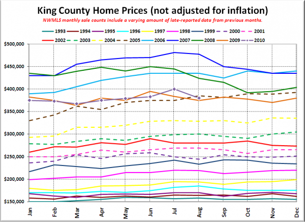
And lastly, here is the chart comparing King County SFH prices each month for every year back to 1994.
Oops, slipped back below the vintage 2005.
Check back tomorrow for the better-late-than-never reporting roundup.
