Sorry this is a day late. I completely spaced yesterday about it being Case-Shiller Day.
Let’s have a look at the latest data from the Case-Shiller Home Price Index. According to July data,
Up 0.1% June to July.
Down 1.6% YOY.
Down 23.5% from the July 2007 peak
Last year prices fell 0.1% from June to July and year-over-year prices were down 15.3%.
A 0.1% change is basically flat, which is a little surprising to see for the first post-tax-credit month, but considering July’s number is actually an average of May through July, I suppose we won’t really begin to see declines in earnest until September’s data is released on November 30th.
Here’s an interactive graph of the year-over-year change in all twenty Case-Shiller-tracked cities, courtesy of Tableau Software (check and un-check the boxes on the right):
Ten of twenty Case-Shiller-tracked cities are now in positive YOY territory: Phoenix, Los Angeles, San Diego, San Francisco, Washington DC, Miami, Boston, Detroit, Minneapolis, and New York. Yes, even Detroit continues to outperforming Seattle YOY. Ouch. Interestingly, five cities dropped from YOY positive to YOY negative: Denver, Atlanta, Cleveland, Portland, and Dallas. Of the remaining 25 cities, only Detroit, Las Vegas, New York, and Seattle saw the YOY number move in the positive direction.
In July, fifteen of the twenty Case-Shiller-tracked cities experienced smaller year-over-year drops (or saw year-over-year increases) than Seattle (two fewer than June):
- San Francisco at +11.2%
- San Diego at +9.3%
- Los Angeles at +7.5%
- Washington, DC at +6.5%
- Minneapolis at +6.4%
- Phoenix at +3.4%
- Boston at +2.8%
- Detroit at +1.3%
- New York at +0.4%
- Miami at +0.4%
- Denver at -0.1%
- Atlanta at -0.2%
- Dallas at -0.4%
- Cleveland at -0.6%
- Portland at -1.2%
Falling faster than Seattle as of July: Chicago, Tampa, Charlotte, and Las Vegas.
Hit the jump for the rest of our monthly Case-Shiller charts, including another interactive charts of the raw data and our monthly offset graph.
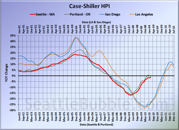
Here’s our offset graph—the same graph we post every month—with L.A. & San Diego time-shifted from Seattle & Portland by 17 months. All four cities actually turned down slightly on this chart in June. Year-over-year, Portland came in at -1.2%, Los Angeles at +7.5%, and San Diego at +9.3%. Seattle is no longer the only West Coast Case-Shiller city still falling year-to-year.
Note: This graph is not intended to be predictive. It is for entertainment purposes only.
Here’s an interactive chart of the raw HPI for all twenty cities through July.
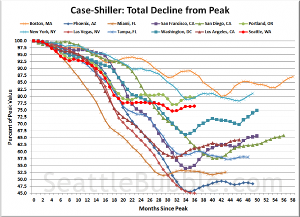
Here’s an update to the peak-decline graph, inspired by a graph created by reader CrystalBall. This chart takes the twelve cities whose peak index was greater than 175, and tracks how far they have fallen so far from their peak. The horizontal axis shows the total number of months since each individual city peaked.
In the thirty-five months since the price peak in Seattle prices have declined 23.5%, slightly less than last month.
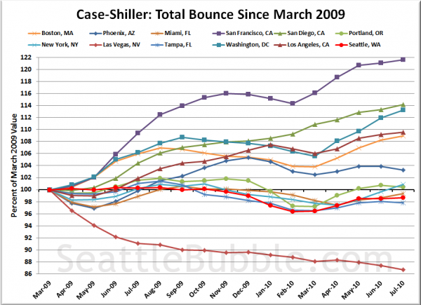
Here’s a complementary chart to that last one. This one shows the total change in the index since March 2009 for the same twelve markets as the peak decline chart.
Except maybe in Washington, DC, there definitely appears to be a distinct softening of the mini-boom we’ve been seeing since early last year. I strongly suspect that most of those lines will be heading back down before the end of the year.
Since I’m posting this a day late, I’ll throw the tiered data up later this afternoon.
(Home Price Indices, Standard & Poor’s, 09.28.2010)


