January market stats have been published by the NWMLS. Here’s their press release: Motivated buyers returning to the housing market.
Dramatic increases in open house activity and shrinking inventory are fueling optimism among members of the Northwest Multiple Listing Service. Commenting on the just-released MLS report on January’s housing activity, one director stated, “There is a strong belief in the industry that the worst is behind us and we can look forward with confidence.”
…
Based on anecdotal reports of open house traffic, brokers are hopeful of upticks in sales.“The buyer activity at open houses in the close in Seattle neighborhoods has increased dramatically in the past month, said Northwest MLS director Mike Skahen. “If there were more good new listings coming on the market there would be more sales,” he suggested.
Oh please. Again with the meaningless “open house traffic” nonsense.
- June 2008: “Open-house traffic is picking up.” – Dick Beeson
- April 2009: “Open house traffic … [has] increased twofold in recent weeks.” – Dick Beeson
- October 2009: “Activity at open houses is reported to be brisk in many areas.” – NWMLS
- March 2010: “Jacobi reported ‘significant traffic’ at open houses” – NWMLS
You get the idea.
All righty then, let’s have a look at the actual numbers, sketchy as they may be.
NWMLS monthly reports include an undisclosed and varying number of
sales from previous months in their pending and closed sales statistics.
Here’s your King County SFH summary, with the arrows to show whether the year-over-year direction of each indicator is favorable or unfavorable news for buyers and sellers (green = favorable, red = unfavorable):
| January 2011 | Number | MOM | YOY | Buyers | Sellers |
|---|---|---|---|---|---|
| New Listings | 2,460 | +68.6% | -20.3% |  |
 |
| Active Listings | 7,507 | +1.9% | -0.2% |  |
 |
| Closed Sales | 1,017 | -30.2% | +6.4% |  |
 |
| SAAS (?) | 1.74 | -12.6% | -25.0% |  |
 |
| Pending Sales | 1,649 | +19.6% | -6.6% |  |
 |
| Months of Supply | 4.55 | -14.7% | +6.8% |  |
 |
| Median Price* | $356,000 | -3.8% | -5.1% |  |
 |
Feel free to download the updated Seattle Bubble Spreadsheet (Excel 2003 format), but keep in mind the caution above.
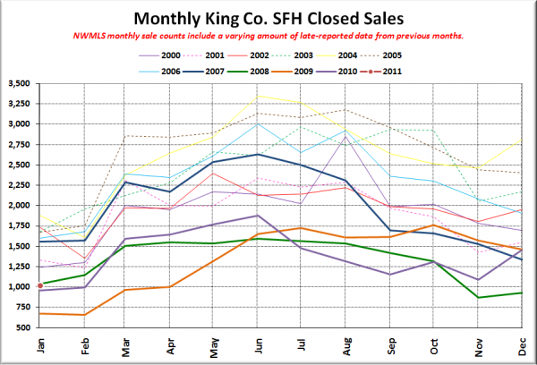
Here’s your closed sales yearly comparison chart:
A slight alleged increase in closed sales compared to a year ago. Other sources do not confirm a number quite this high. Even still, if we take the NWMLS number as reality, January still saw lower closed sales than any year other than 2009 or 2010.
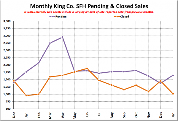
Here’s the last year or so of pending and closed sales according to NWMLS.
Pending sales still below last year’s levels, and not increasing quite as fast as they did last year.
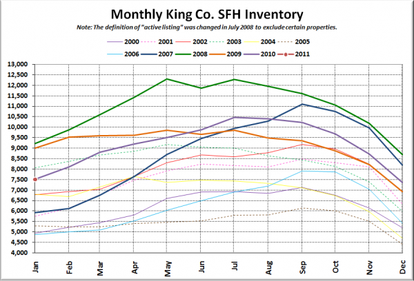
Here’s the graph of inventory with each year overlaid on the same chart.
2011’s red dot sits almost directly on top of last year’s. I predict next month it will drop below.
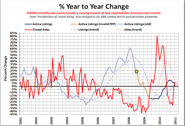
Here’s the supply/demand YOY graph. In place of the now-unreliable measure of pending sales, the “demand” in this chart is represented by closed sales, which have had a consistent definition throughout the decade.
Another crossing, though the momentum is not quite as strong as it was the last time we crossed this direction in May 2009.
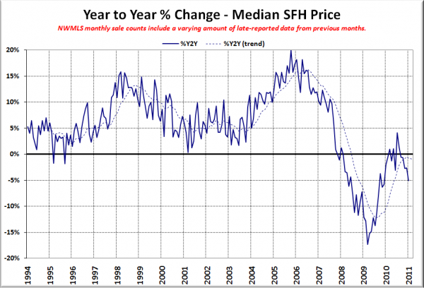
Here’s the median home price YOY change graph:
Another tick backward.
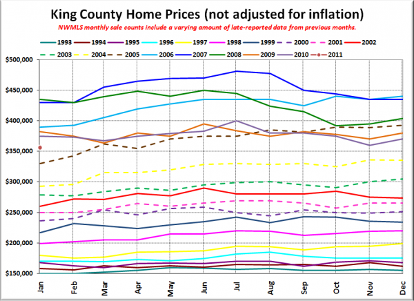
And lastly, here is the chart comparing King County SFH prices each month for every year back to 1994.
January’s price drop puts us roughly on par with March/April 2005. April 2005: $355,000. January 2011: $356,000.
I’ll round up local press reactions to January’s numbers on Monday.
