Time for another sweet market status Tableau map.
This time I’ve taken all the active listings as of February 17th and all the closed sales between January 1st 2010 and February 17th 2011, and slapped them all onto the same map. Crazy!
Click any zip code’s circle to update all the pies and bars below the map to show you the specific stats breakdown for that zip code. I’ve broken down the ratios of bank-owned, short sale, and non-distressed listings and sales as well as the median price and days on market for each bucket as well.
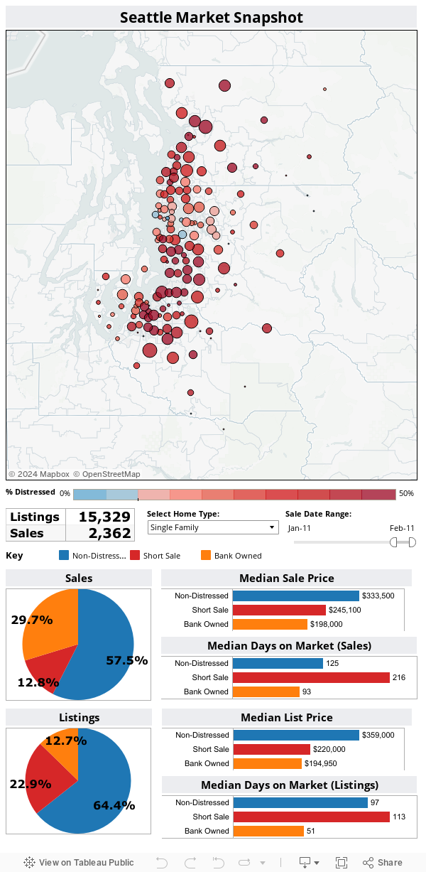
The circles are color-coded based on how “distressed” the listings and sales in the given zip code are. Zip codes that are less than 10% distressed are shades of blue, while over 10% is darker and darker red. Not a lot of blue out there.
Interestingly, the zip codes with the most activity also seem to be the ones where the largest percentages of homes being sold are bank owned. The basic story seems to be that it’s hard to move the non-distressed inventory.
Please be patient. This viz is pretty big, so it may take a few seconds to load and to react to your click when you select a zip code.