Happy Case-Shiller day, everybody. Yes, it’s time once again for us to take a look at the latest data from the Case-Shiller Home Price Index. According to March data, Seattle home prices were:
Up 0.1% February to March.
Down 7.5% YOY.
Down 30.9% from the July 2007 peak
Last year prices also rose 0.1% from February to January, while year-over-year prices were down just 3.6%.
Pretty much the exact same seasonal bump that we saw last year at this time. If we see the same sort of action this year over the next few months, we can expect to see the index rise a few percent before flatlining again and resuming the decline in August. That sounds like a fairly likely outcome, although I expect the bump and subsequent decline to both be smaller this year than last.
Here’s an interactive graph of all twenty Case-Shiller-tracked cities, courtesy of Tableau Software (check and un-check the boxes on the right):
Still only one city in positive YOY territory: Washington DC.
In March, fifteen of the twenty Case-Shiller-tracked cities experienced smaller year-over-year drops (or saw year-over-year increases) than Seattle (one less than February):
- Washington, DC at +2.7%
- Detroit at -0.9%
- Los Angeles at -1.7%
- Dallas at -2.5%
- Boston at -2.7%
- New York at -3.4%
- Denver at -3.8%
- San Diego at -4.0%
- San Francisco at -5.1%
- Atlanta at -5.2%
- Las Vegas at -5.3%
- Miami at -6.1%
- Cleveland at -6.3%
- Charlotte at -6.8%
- Tampa at -6.9%
Falling faster than Seattle as of February: Portland, Chicago, Phoenix, and Minneapolis.
Hit the jump for the rest of our monthly Case-Shiller charts, including the interactive chart of the raw Case-Shiller HPIs.
Here’s the interactive chart of the raw HPI for all twenty cities through November.
Twelve of the twenty cities tracked by Case-Shiller hit new post-peak lows in March, as did the 20-city Composite index.
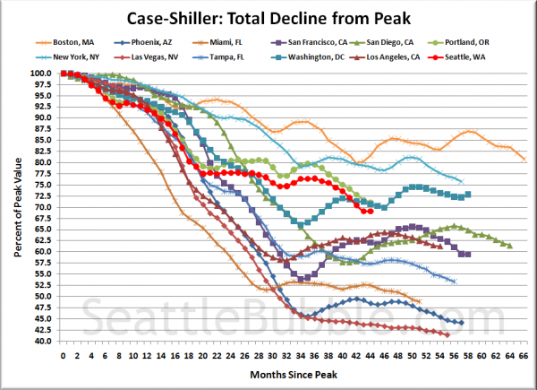
Here’s an update to the peak-decline graph, inspired by a graph created by reader CrystalBall. This chart takes the twelve cities whose peak index was greater than 175, and tracks how far they have fallen so far from their peak. The horizontal axis shows the total number of months since each individual city peaked.
In the forty-four months since the price peak in Seattle prices have declined 30.9%, basically exactly where they were last month.
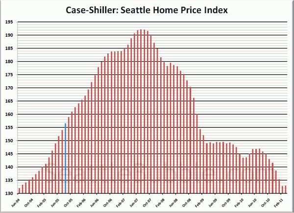
Here’s the “rewind” chart, to show you how much was gained, and then given back up over the last six-plus years:
The blue line on August 2005 represents the month that this site launched. As of March 2011, there have effectively been zero price gains since June 2004.
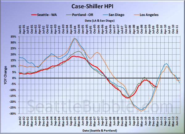
For posterity, here’s our offset graph—the same graph we post every month—with L.A. & San Diego time-shifted from Seattle & Portland by 17 months. All four cities fell yet again in December. Year-over-year, Portland came in at -7.6%, Los Angeles at -1.7%, and San Diego at -4.0%. That’s quite the sudden divergence between LA and San Diego.
I think this graph is still worth posting if only to display how the government’s massive intervention in the market screwed with the natural flow, causing all the markets to rise simultaneously, and once the artificial support was removed, to come crashing back down to reality simultaneously.
Note: This graph is not intended to be predictive. It is for entertainment purposes only.
Check back tomorrow for a post on the Case-Shiller data for Seattle’s price tiers.
(Home Price Indices, Standard & Poor’s, 05.31.2011)


