Let’s check out the three price tiers for the Seattle area, as measured by Case-Shiller. Remember, Case-Shiller’s “Seattle” data is based on single-family home repeat sales in King, Pierce, and Snohomish counties.
Note that the tiers are determined by sale volume. In other words, 1/3 of all sales fall into each tier. For more details on the tier methodologies, hit the full methodology pdf. Here are the current tier breakpoints:
- Low Tier: < $241,624 (up <0.1%)
- Mid Tier: $241,624 – $380,492
- Hi Tier: > $380,492 (up <0.1%)
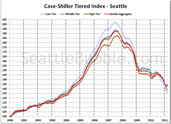
First up is the straight graph of the index from January 2000 through March 2011.
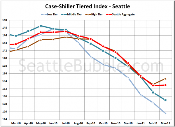
Here’s a zoom-in, showing just the last year:
Oddly, only the high tier gained any ground in March. Both the low and middle tier continued to drop like a rock. The low tier dropped 2.2% MOM, the middle tier fell 1.6%, and the high tier rose 1.1%.
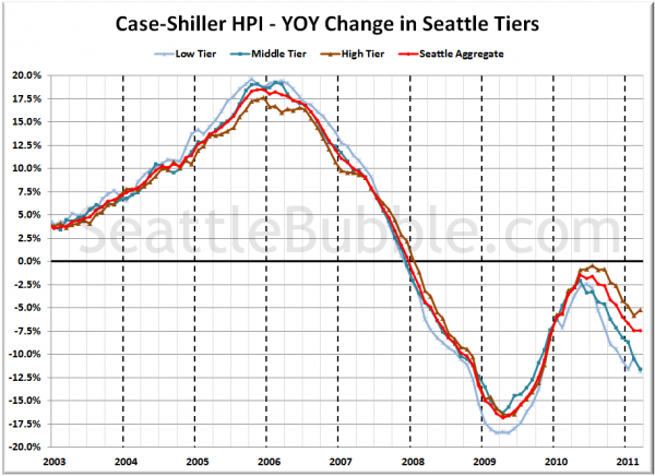
Here’s a chart of the year-over-year change in the index from January 2003 through March 2011.
The low and middle tier both continued their march well into double-digit territory, while the high tier improved slightly. Here’s where the tiers sit YOY as of March – Low: -11.9%, Med: -11.6%, Hi: -5.2%.
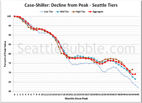
Lastly, here’s a decline-from-peak graph like the one posted yesterday, but looking only at the Seattle tiers.
Current standing is 38.0% off peak for the low tier, 33.4% off peak for the middle tier, and 28.2% off peak for the high tier.
(Home Price Indices, Standard & Poor’s, 05.31.2011)


