Let’s have a look at the latest data from the Case-Shiller Home Price Index. According to July data,
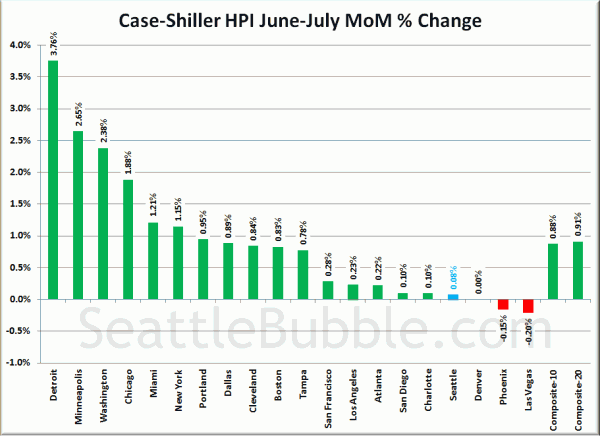
Up 0.1% June to July.
Down 6.4% YOY.
Down 28.5% from the July 2007 peak
Last year prices rose 0.1% from June to July and year-over-year prices were down 1.6%.
Seattle’s Case-Shiller index has risen now for five months in a row, but keep in mind that they pretty much always rise in the spring and summer months.
Here’s an interactive graph of the year-over-year change for all twenty Case-Shiller-tracked cities, courtesy of Tableau Software (check and un-check the boxes on the right):
Despite the spring bounce going on throughout the country, every city is currently in negative YOY territory (including DC after a recent revision). Meanwhile, every city actually gained ground month-to-month for the first time in a long time.
Seattle’s summer seems to be coming in a lot less strong than most of the other markets around the country.
Hit the jump for the rest of our monthly Case-Shiller charts, including the interactive chart of raw index data for all 20 cities.
In July, fifteen of the twenty Case-Shiller-tracked cities experienced smaller year-over-year drops (or saw increases) than Seattle:
- Detroit at +1.2%
- Washington, DC at +0.3%
- Boston at -1.9%
- Denver at -2.1%
- Dallas at -3.2%
- Los Angeles at -3.5%
- New York at -3.7%
- Charlotte at -3.9%
- Miami at -4.6%
- Atlanta at -5.0%
- Las Vegas at -5.4%
- Cleveland at -5.4%
- San Francisco at -5.6%
- San Diego at -5.9%
- Tampa at -6.2%
Just four cities were falling faster than Seattle as of July: Chicago, Portland, Phoenix, and Minneapolis.
Here’s the interactive chart of the raw HPI for all twenty cities through July.
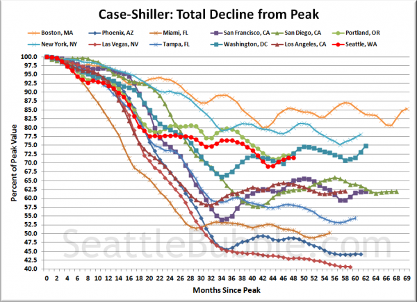
Here’s an update to the peak-decline graph, inspired by a graph created by reader CrystalBall. This chart takes the twelve cities whose peak index was greater than 175, and tracks how far they have fallen so far from their peak. The horizontal axis shows the total number of months since each individual city peaked.
In the forty-eight months since the price peak in Seattle prices have declined 28.5%, the same as last month, up 2.4 points off the low. Four years. What a ride.
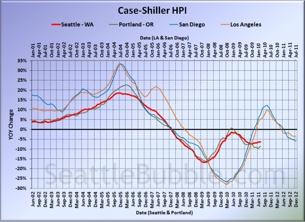
For posterity, here’s our offset graph—the same graph we post every month—with L.A. & San Diego time-shifted from Seattle & Portland by 17 months. Portland improved slightly, but everyone else continued to get worse on this chart. Year-over-year, Portland came in at -8.4%, Los Angeles at -3.5%, and San Diego at -5.9%.
I think this graph is still worth posting if only to display how the government’s massive intervention in the market screwed with the natural flow, causing all the markets to rise simultaneously, and once the artificial support was removed, to come crashing back down to reality simultaneously.
Note: This graph is not intended to be predictive. It is for entertainment purposes only.
Check back tomorrow for a post on the Case-Shiller data for Seattle’s price tiers.
(Home Price Indices, Standard & Poor’s, 09.27.2011)


