I realized last week that it has been almost exactly a year since I first posted the price percentile data. It’s way past time for an update to that data set.
Here’s how I break down the price percentiles for these posts. Each bucket is a cutoff where some percentage of homes sold below that price, while the remaining percentage sold above that price.
- Bottom: 10% below, 90% above.
- Low: 25% below, 75% above.
- Median: 50% below, 50% above.
- High: 75% below, 25% above.
- Top: 90% below, 10% above.
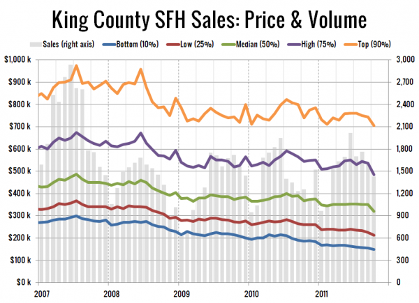
First up, a long-term view of the five percentiles, going all the way back to January 2007, shortly before King County’s peak pricing.
It’s crazy to realize that in July 2007, just 10% of homes sold in King County cost less than $300,000. In October 2011, 47% of homes were under $300,000. Wow.
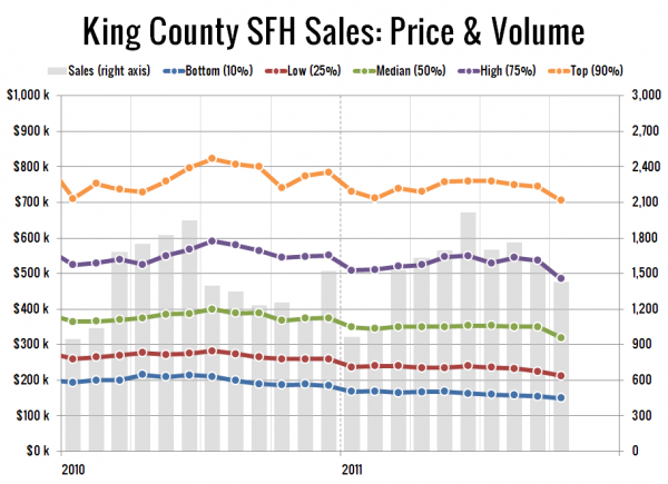
Here’s a closeup look at just 2010 and 2011:
In October all five tiers shot down to new lows. The bottom 10% dropped below $150,000 for the first time in my data—50% off the peak. Here’s where all five percentiles fall compared to their respective peaks as of October:
- Bottom: 50% off peak
- Low: 42% off peak
- Median: 34% off peak
- High: 28% off peak
- Top: 28% off peak
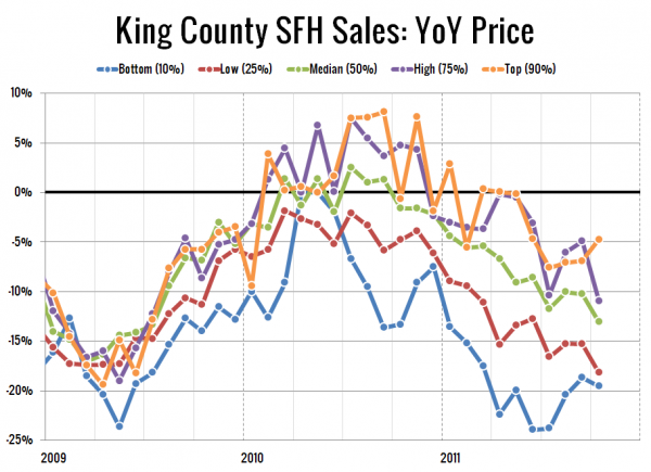
Lastly, here’s a look at the year-over-year price changes in each of the five percentiles.
And here’s where they stand as of October:
- Bottom: down 20%
- Low: down 18%
- Median: down 13%
- High: down 11%
- Top: down 5%
The bottom percentile is getting absolutely hammered.


