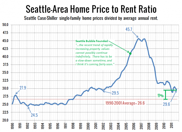
Big Picture Week 2011 continues with an updated look at Seattle’s price to rent ratio. Here’s our chart of single-family home prices divided by annual rent:
Another chart with dramatic improvement since last year’s Big Picture Week. When last we checked in on this measure (June 2010 data), the ratio was 20% above its 1990-2001 average. As of September (the latest Case-Shiller data available), it’s down to just 11% above the 1990-2001 average, and right in line with where it sat between 2000 and 2002.
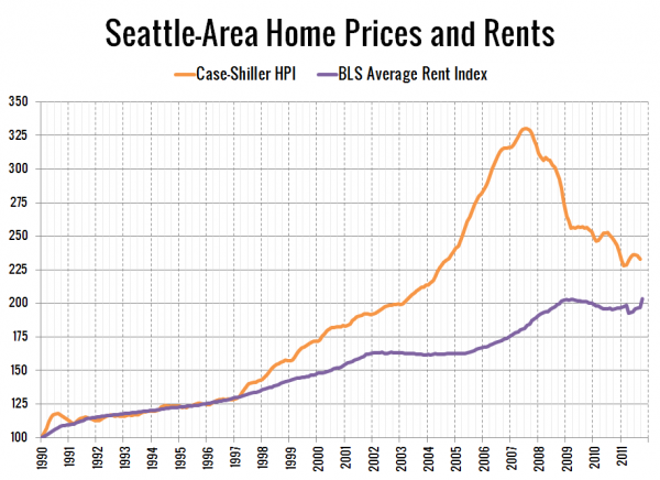
Here’s a different look at the same data, with prices and rents split up and each series indexed to January 1990 = 100 so you can see how each has been moving independently:
Rents hit an all-time high in October, and appear to be headed up again after (predictably) stagnating between 2009 and 2011. If rents rise another 4% and home prices fell another 4%—an entirely plausible scenario over the next year—the two lines will line back up again for the first time in fifteen years.
Last year based on this data, I estimated that Seattle home prices had another ten to twenty percent to drop before they would line back up with the economic fundamentals. Since that time, the King County median home price has fallen 15% ($380k to $322k). I’d say maybe five percent more to go sounds about right.
Big Picture Week on Seattle Bubble

