December market stats were published by the NWMLS this afternoon. Here’s their press release: “Healthy marketplaces” emerging with shrinking inventory, favorable financing
“All over we are seeing healthy marketplaces emerge as the inventory levels drop,” said J. Lennox Scott, CEO and chairman of John L. Scott Real Estate. “As you get closer to the job centers of Seattle and Bellevue, the marketplace is looking strong again,” he added while expressing optimism for the coming year. “The outlook for 2012 is the continuation of a strengthening marketplace, especially in the more affordable to mid range priced homes.”
…
OB Jacobi, president of Windermere Real Estate, believes the market has undergone a shift. “Where we’ve been during the past year is a place of transition. It has been a slow recovery, but the housing market has finally turned a corner, albeit a soft one with some bumps along the way,” he commented.
Those claims that “we are seeing healthy marketplaces emerge” and “the housing market has finally turned a corner” sound an awful lot thinly-veiled bottom calls to me. Those tend to work out well for the bottom-caller.
Okay, on with the stats!
NWMLS monthly reports include an undisclosed and varying number of
sales from previous months in their pending and closed sales statistics.
Here’s your King County SFH summary, with the arrows to show whether the year-over-year direction of each indicator is favorable or unfavorable news for buyers and sellers (green = favorable, red = unfavorable):
| December 2011 | Number | MOM | YOY | Buyers | Sellers |
|---|---|---|---|---|---|
| Active Listings | 5,491 | -15.4% | -25.4% |  |
 |
| Closed Sales | 1,466 | -4.7% | +0.5% |  |
 |
| SAAS (?) | 1.61 | +19.5% | -19.5% |  |
 |
| Pending Sales | 1,592 | -17.3% | +15.4% |  |
 |
| Months of Supply | 3.45 | +2.4% | -35.4% |  |
 |
| Median Price* | $320,000 | -0.5% | -13.5% |  |
 |
Feel free to download the updated Seattle Bubble Spreadsheet (Excel 2003 format), but keep in mind the caution above.
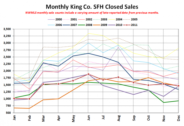
Here’s your closed sales yearly comparison chart:
Six of the last twelve years have seen an increase in closed sales between November and December, with the average change being +3.2%. This year’s -4.7% change doesn’t exactly strike me as either an “emerging healthy marketplace” or like we’ve “turned a corner.” But whatever.
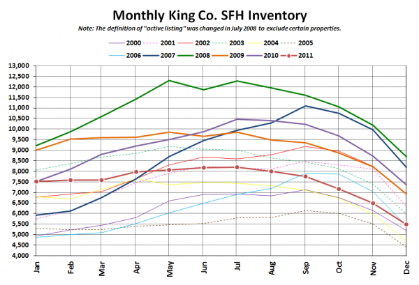
Here’s the graph of inventory with each year overlaid on the same chart.
Same old story there. Lots of trapped would-be sellers out there. Pent-up supply!
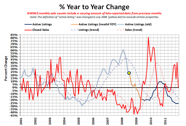
Here’s the supply/demand YOY graph. In place of the now-unreliable measure of pending sales, the “demand” in this chart is represented by closed sales, which have had a consistent definition throughout the decade.
Whoops, the sales line took a huge tumble on this one, thanks to last year’s weird/bogus December sales counts.
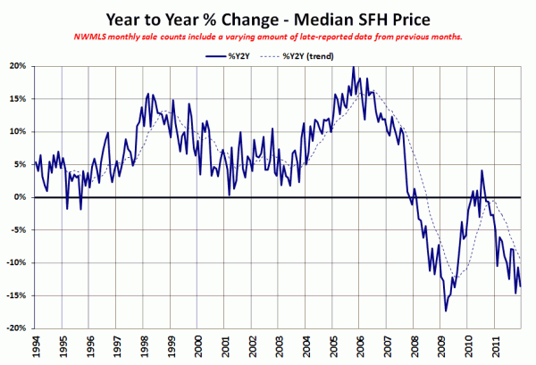
Here’s the median home price YOY change graph:
Back down it goes.
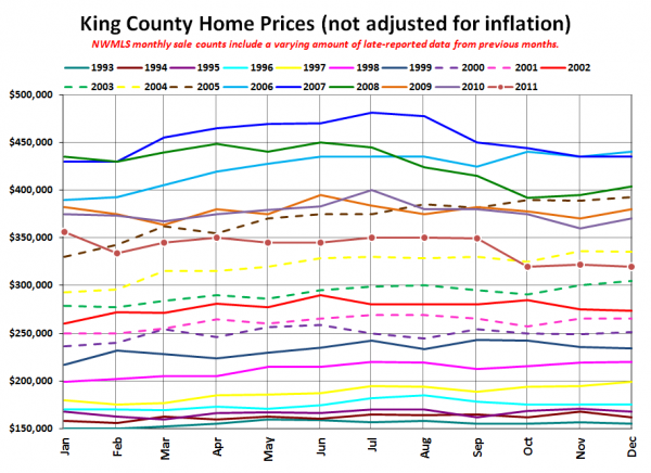
And lastly, here is the chart comparing King County SFH prices each month for every year back to 1994.
December 2011: $320,000
May 2004: $320,000
Here are today’s headlines from the Times and the P-I:
Seattle Times: King County median home price falls by double digits again
Seattle P-I: Home sale surge abated in December
There was no “home sale surge” in the first place, so I don’t know how it could have “abated,” but whatever.
Check back tomorrow for the full reporting roundup.

