Let’s check out the three price tiers for the Seattle area, as measured by Case-Shiller. Remember, Case-Shiller’s “Seattle” data is based on single-family home repeat sales in King, Pierce, and Snohomish counties.
Note that the tiers are determined by sale volume. In other words, 1/3 of all sales fall into each tier. For more details on the tier methodologies, hit the full methodology pdf. Here are the current tier breakpoints:
- Low Tier: < $245,591 (up 3.1%)
- Mid Tier: $245,591 – $389,559
- Hi Tier: > $389,559 (up 3.2%)
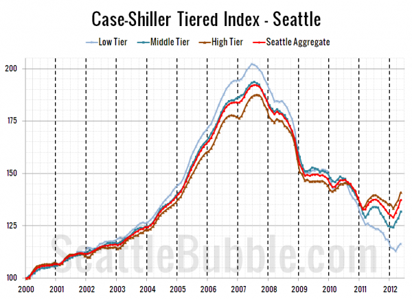
First up is the straight graph of the index from January 2000 through May 2012.
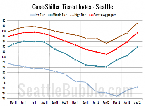
Here’s a zoom-in, showing just the last year:
All three tiers have been on a solid upward trend this spring ever since the low tier bottomed out in March. Between April and May, the low tier rose 1.1% MOM, the middle tier increased 2.6%, and the high tier gained 2.7%.
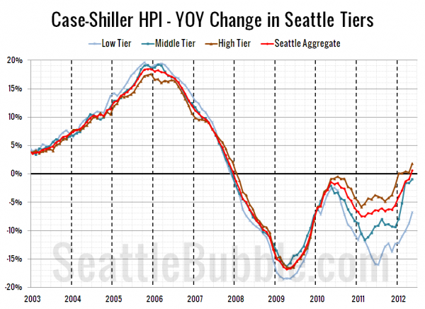
Here’s a chart of the year-over-year change in the index from January 2003 through May 2012.
Everybody’s been heading upward fairly consistently on this one since July 2011. Here’s where the tiers sit YOY as of May – Low: -6.8%, Med: -0.9%, Hi: +1.8%.
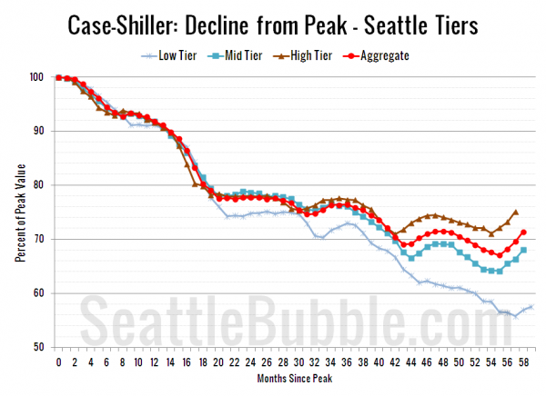
Lastly, here’s a decline-from-peak graph like the one posted yesterday, but looking only at the Seattle tiers.
Current standing is 42.4% off peak for the low tier, 32.0% off peak for the middle tier, and 24.8% off peak for the high tier. Everybody is up off the low points set earlier this year.
(Home Price Indices, Standard & Poor’s, 7.31.2012)


