Before we put away the Case-Shiller data for another month, let’s check in on a few of our alternative charts.
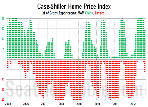
First up, let’s take a look at the twenty-city month-over-month scorecard. Here’s the original post introducing this chart if you’d like more details.
2012 had the strongest summer for month-over-month increases since 2005, with five months in a row where 19 or 20 cities were all increasing at once.
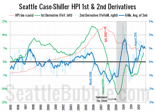
Next up, the second derivative. For an introduction to this particular view, hit the original post from March.
The second derivative has leveled off somewhat over the last six months or so, but as long as it stays positive, the size of price gains are increasing. I expect that it will begin to move back down toward zero as price gains eventually stabilize around 3-5% per year (barring large changes in the mix).
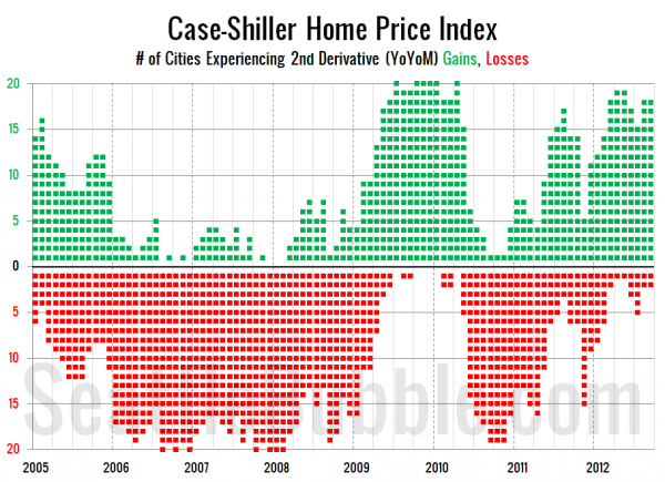
Finally, here’s a look at the number of cities that are experiencing second derivative gains or losses.
Stronger performance than in 2005, though not as crazy as during the tax credit.


