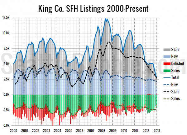
Here’s a view on listings that we haven’t visited in a while. In this chart I use the NWMLS-published data on new listings, pending sales, and total inventory to visualize the inflow and outflow of single-family listings in King County.
First up is a chart that goes back as far as NWMLS data is available:
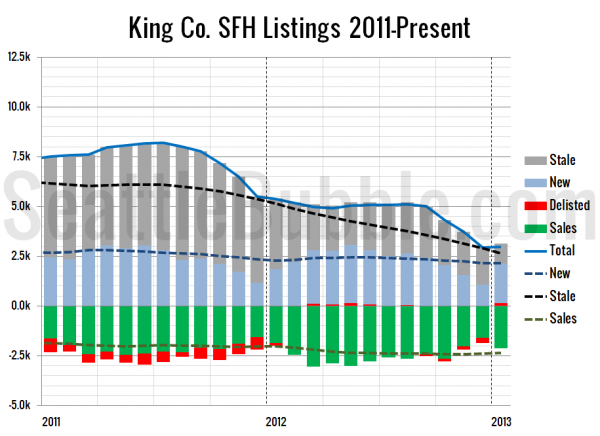
Now a zoom-in of just the last couple years:
In theory it shouldn’t be possible for “delisted” to show up as a positive number in this chart as it has off and on over the last year or so. I assume that this is happening due to late-reported pending sales from agents and the unusual way the NWMLS records their statistics. Despite that confusion, this chart does a good job of showing just how tight the market has gotten in the last year. Very few homes are being delisted without selling.
In the 18 months following the July 2007 price peak in Seattle, an average of 1,608 homes were delisted each month. In the last 12 months that number has averaged just 21.
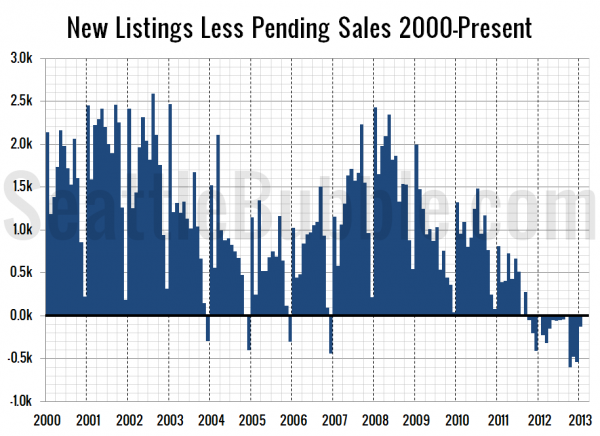
Finally, here’s a look at the monthly flow of new listings less pending sales:
The average value in the chart above from 2007 through 2009 was a net gain of 1,288 listings per month. In the last 12 months the average has been a net loss of 221 listings per month.
As far as supply and demand goes, it’s definitely not a great time to be a buyer right now.


