May market stats were published by the NWMLS this afternoon. Here’s a snippet from their press release: Competition among home buyers "still fierce;" rising interest rates adding to fury.
Commenting on the latest report, brokers said the fast pace is frustrating some buyers — and surprising sellers with unrealistic expectations. One broker cautioned against an overheated market. “We do not want a market that escalates too fast and topples again,” commented Frank Wilson, Kitsap district manager at John L. Scott Real Estate and branch managing broker for its Poulsbo/Kingston office.
Yeah, most real estate agents just want that first part. If the bit about toppling could be avoided that would be great.
All righty, on with our usual monthly stats.
NWMLS monthly reports include an undisclosed and varying number of
sales from previous months in their pending and closed sales statistics.
Here’s your King County SFH summary, with the arrows to show whether the year-over-year direction of each indicator is favorable or unfavorable news for buyers and sellers (green = favorable, red = unfavorable):
| May 2013 | Number | MOM | YOY | Buyers | Sellers |
|---|---|---|---|---|---|
| Active Listings | 3,759 | +16.7% | -25.4% |  |
 |
| Closed Sales | 2,516 | +20.0% | +22.4% |  |
 |
| SAAS (?) | 1.37 | -4.4% | -1.7% |  |
 |
| Pending Sales | 3,236 | +6.0% | +8.6% |  |
 |
| Months of Supply | 1.16 | +10.1% | -31.3% |  |
 |
| Median Price* | $417,500 | +4.4% | +15.3% |  |
 |
Feel free to download the updated Seattle Bubble Spreadsheet (Excel 2003 format), but keep in mind the caution above.
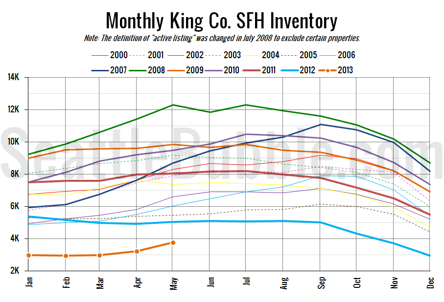
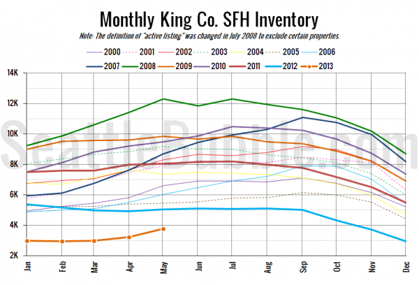
As forecasted Monday in our stats preview, inventory gained some more ground from April to May. May’s 16.7% month-over-month increase in listings is actually the largest on record as far back as my data goes (January 2000). Last month I said that “we can’t really jump to any conclusions from a single month of data,” but now that we’ve got two months showing the same trend, I’m more optimistic that inventory is on the rebound.
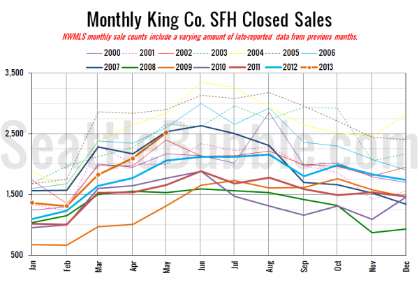
Here’s your closed sales yearly comparison chart:
Closed sales hit their highest level since June 2007, making it all the more impressive that inventory was able to stage such a large increase.
Here’s the graph of inventory with each year overlaid on the same chart.
There’s still a long ways to go before we can call inventory “normal,” but at least we’re finally heading in the right direction.
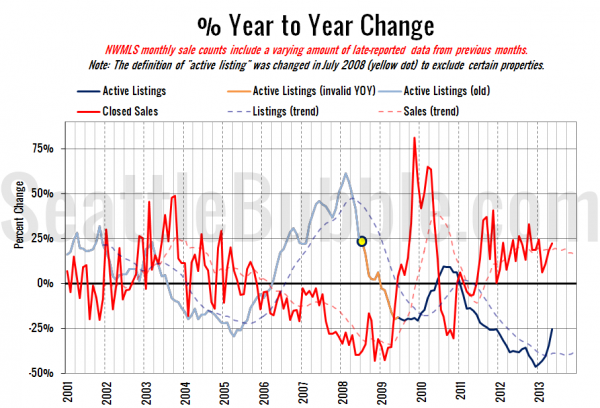
Here’s the supply/demand YOY graph. In place of the now-unreliable measure of pending sales, the “demand” in this chart is represented by closed sales, which have had a consistent definition throughout the decade.
Sharp increase in both the listings and sales curves over the last couple of months.
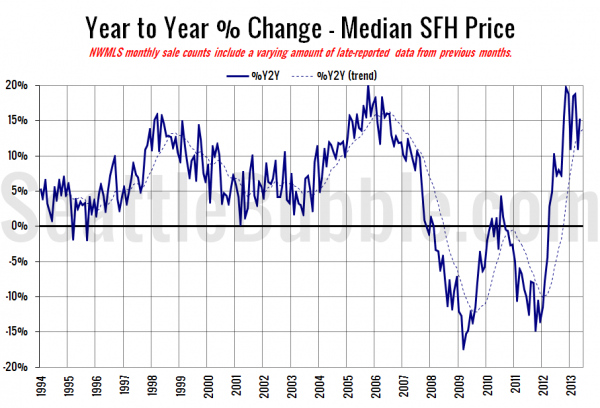
Here’s the median home price YOY change graph:
Another spike up as the median home price gained $17,500 in a single month.
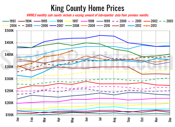
And lastly, here is the chart comparing King County SFH prices each month for every year back to 1994.
May 2013: $417,500
April 2006: $419,500
Here are today’s articles from the Times and P-I:
Seattle Times: More buyers than sellers push King County home prices up
Seattle P-I: Surging home prices fuel fears of a new bubble
Check back tomorrow for the full reporting roundup.
