Let’s take one more look at how listings are recovering over the last few months.
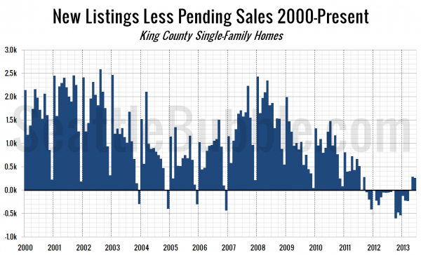
This first chart shows the difference between the number of new listings each month and the number of pending sales. Prior to late 2011 this number was almost always positive, except in December, when very few new listings hit the market. Beginning in October 2011 and continuing through March 2013, this measure turned negative. The inventory squeeze was on.
Beginning in April, and continuing in May and June, this measure is back in the black.
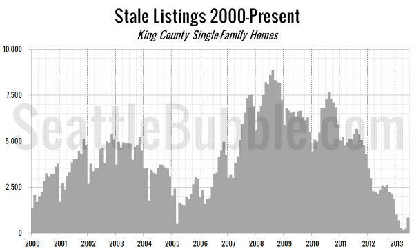
Next, let’s take a look at the “stale listings” measure, which uses the total listings, new listings, and pending sales counts to estimate how many listings are “carried over” from one month to the next.
Stale listings hit an all-time low in March at just 270 homes, but have recovered to 848 homes as of June. This is still well below the common pre-bubble levels between 2,500 and 5,000, but at least the direction has turned around after falling fairly consistently since mid-2010.


