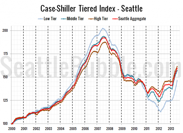
Let’s check out the three price tiers for the Seattle area, as measured by Case-Shiller. Remember, Case-Shiller’s “Seattle” data is based on single-family home repeat sales in King, Pierce, and Snohomish counties.
Note that the tiers are determined by sale volume. In other words, 1/3 of all sales fall into each tier. For more details on the tier methodologies, hit the full methodology pdf. Here are the current tier breakpoints:
- Low Tier: < $284,068 (up 2.1%)
- Mid Tier: $284,068 – $452,281
- Hi Tier: > $452,281 (up 1.7%)
First up is the straight graph of the index from January 2000 through July 2013.
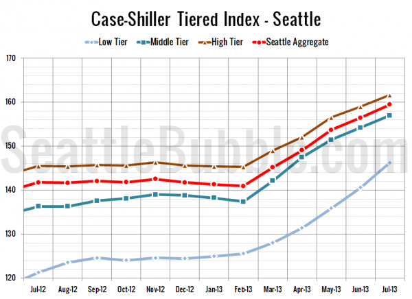
Here’s a zoom-in, showing just the last year:
All three tiers posted gains again in July, with the low tier once again gaining the by far the most in the month. Between June and July, the low tier rose 4.0%, the middle tier was up 1.8%, and the high tier gained 1.6%.
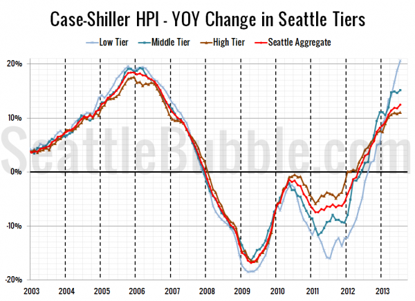
Here’s a chart of the year-over-year change in the index from January 2003 through July 2013.
The low tier was also the biggest gainer yet again in year-over-year growth from a year ago, hitting a ridiculously unsustainable level of 20.6% in July. None of the tiers ever hit 20% or more year-over-year growth, even during the height of the housing bubble. If this keeps up we’re definitely being set up for another crash, but I suspect things will level off very soon with the recent increases we’ve seen in interest rates and inventory. Here’s where the tiers sit YOY as of July – Low: +20.6%, Med: +15.2%, Hi: +11.0%.
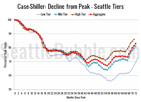
Lastly, here’s a decline-from-peak graph like the one posted yesterday, but looking only at the Seattle tiers.
It seems likely that the low tier is rising so much quicker than the other tiers because it fell so much further. Even with the recent dramatic gains, the low tier is still the furthest from its peak pricing. Current standing is 27.7% off peak for the low tier, 19.0% off peak for the middle tier, and 13.8% off peak for the high tier.
(Home Price Indices, Standard & Poor’s, 09.24.2013)


