Let’s take a closer look at how listings fared in February of this year compared to years past.
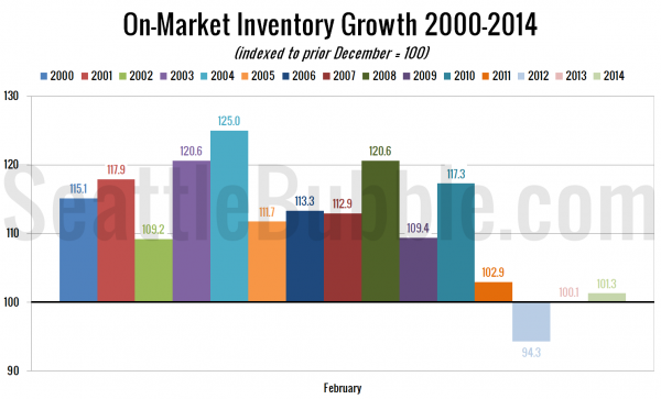
Here’s a view of how inventory has grown so far this year:
Compared to last December, the growth of on-market inventory is at its best point in three years. Unfortunately that isn’t saying much. The anemic 1.3 percent increase is still far smaller than the 14 percent average growth we saw before the housing bubble popped.
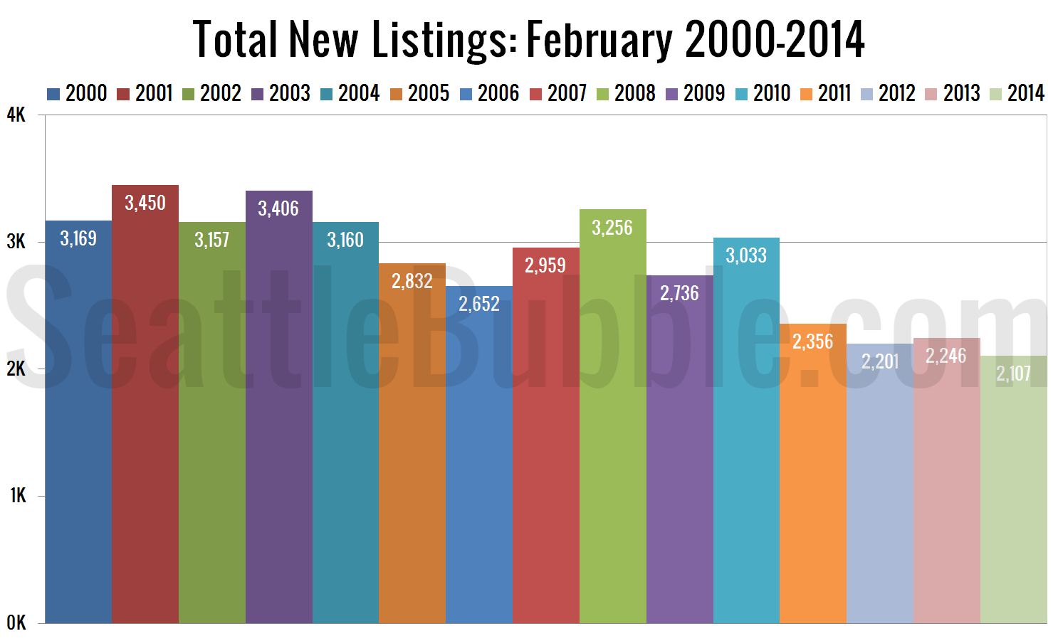
Next, here’s how many new listings hit the market, comparing 2014 to every year I’ve got data for.
For new listings, this February was the worst on record.
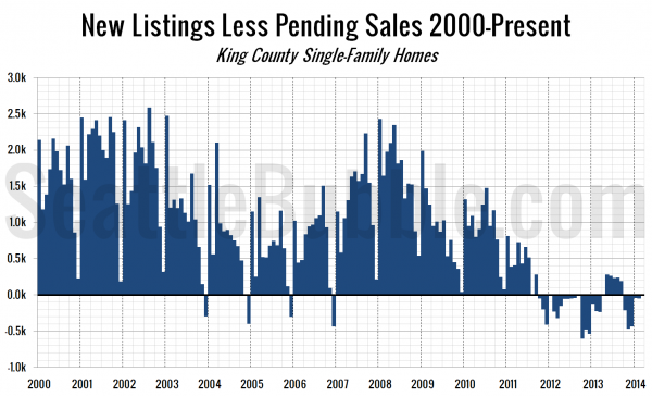
The next chart shows the difference between the number of new listings each month and the number of pending sales. Prior to late 2011 this number was almost always positive, except in December, when very few new listings hit the market. From October 2011 through March 2013 this measure was negative, indicating very tight inventory.
Still just slightly in the red on this measure.
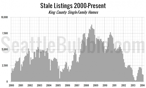
Finally, let’s take a look at the “stale listings” measure, which uses the total listings, new listings, and pending sales counts to estimate how many listings are “carried over” from one month to the next.
Stale listings were nearly unchanged from January to February.
So far this year is definitely shaping up to be another frustrating year for buyers hoping for good selection.
