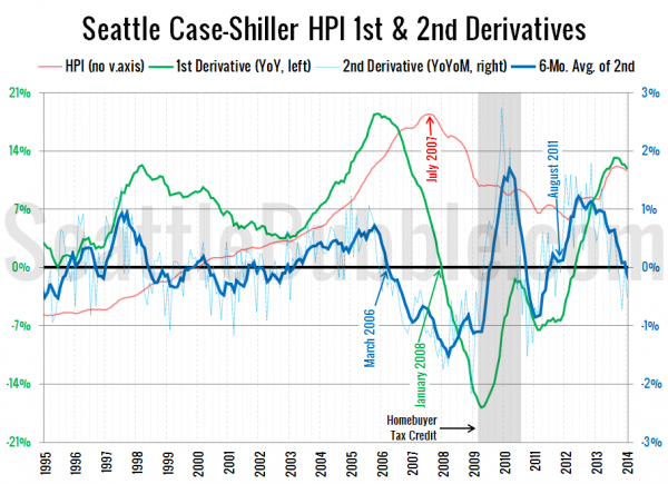
A reader requested an update to the second derivative chart of Seattle home prices, so here we go.
This is a chart of the rate of change in the year-over-year change—the second derivative. For a more detailed explanation and some highlights of past inflection points, check out the original 2012 introduction of this chart.
Here’s what that chart looks like as of the January Case-Shiller data that was released this week:
Home prices peaked locally in July 2007, but the second derivative went negative about a year earlier in March 2006. After the effects of the homebuyer tax credit, the second derivative moved back into the black by August 2011, about six months before home prices bottomed out.
As of January, the second derivative has moved back into negative territory. If the second derivative stays in the red, this will likely indicate that home prices will flatten out or even decline within the next year or so.

