It’s time once again to take an updated look at how King County’s sales are shifting between the different regions around the county, since geographic shifts can and do affect the median price.
In order to explore this concept, we break King County down into three regions, based on the NWMLS-defined “areas”:
- low end: South County (areas 100-130 & 300-360)
- mid range: Seattle / North County (areas 140, 380-390, & 700-800)
- high end: Eastside (areas 500-600)
Here’s where each region’s median prices came in as of March data:
- low end: $217,500-$412,500
- mid range: $334,500-$716,000
- high end: $506,000-$1,221,000
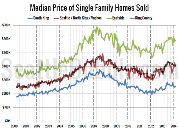
First up, let’s have a look at each region’s (approximate) median price (actually the median of the medians for each area within the region).
The median price in the middle tier fell between February and March, while the low and high tiers saw prices increase. The low tier rose 2.8 percent in the month, the middle tier decreased 6.9 percent, and the high tier gained 1.8 percent. Meanwhile, the median price in all three tiers is still up year-over-year. Here’s how the median prices changed year-over-year. Low tier: +10.4%, middle tier: +4.7%, high tier: +7.1%.
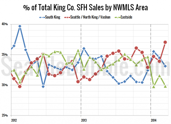
Next up, the percentage of each month’s closed sales that took place in each of the three regions.
The share of sales in the Eastside continued to drop off in March, with most of the difference being taken by Seattle. Just three months ago in December, 33 percent of King County single family home sales were in Seattle, while 35 percent were on the Eastside. In March, those numbers have flipped to 37 percent in Seattle and just 30 percent on the Eastside. Seattle is also the only region in the county where sales are up from a year ago. Year-over-year sales were down 3.4 percent in the low tier, up 16.3 percent in the middle tier, and down 11.8 percent in the high tier.
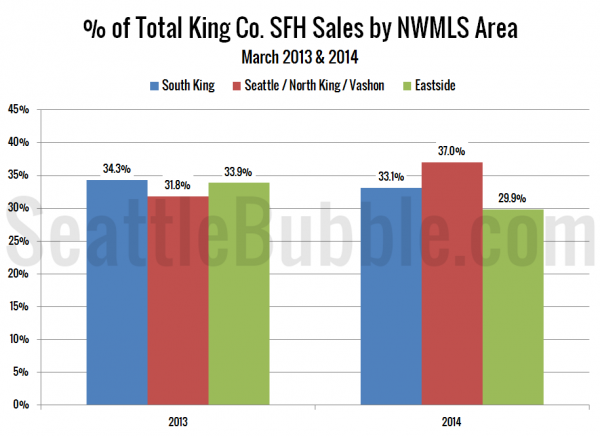
As of March 2014, 33.1 percent of sales were in the low end regions, 37.0 percent in the mid range, and 29.9 percent in the high end. A year ago the mid range had less of the share and the high range more: In March 2013 the low end made up 34.3 percent of the sales, the mid range was 31.8 percent, and the high end was 33.9 percent.
Here’s that information in a visual format:
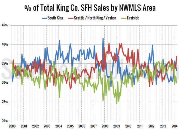
Finally, here’s an updated look at the percentage of sales data all the way back through 2000:
In the pre-bubble market between 2001 and 2004, the volume of sales in the low tier typically had the largest share (35.8 percent on average across the period), followed by the middle tier (32.6 percent), followed by the high tier (31.6 percent). The mix we’ve got now with the middle tier taking the clear sales lead is definitely abnormal.


