Local startup Surefield launched as a brokerage in April, offering home sellers detailed, virtual-reality-style online 3D tours. A major part of their site is the listing detail pages, which hold their signature 3D tours and basic listing info about the home.
Most other real estate listing sites have settled on a fairly standard layout for home listing detail pages—two columns, address and price at the top, photos on the upper-left, bullet-point list of property features, etc. Compare this Capitol Hill listing’s page on Redfin, Zillow, and Trulia for a good example of what has become the standard layout.
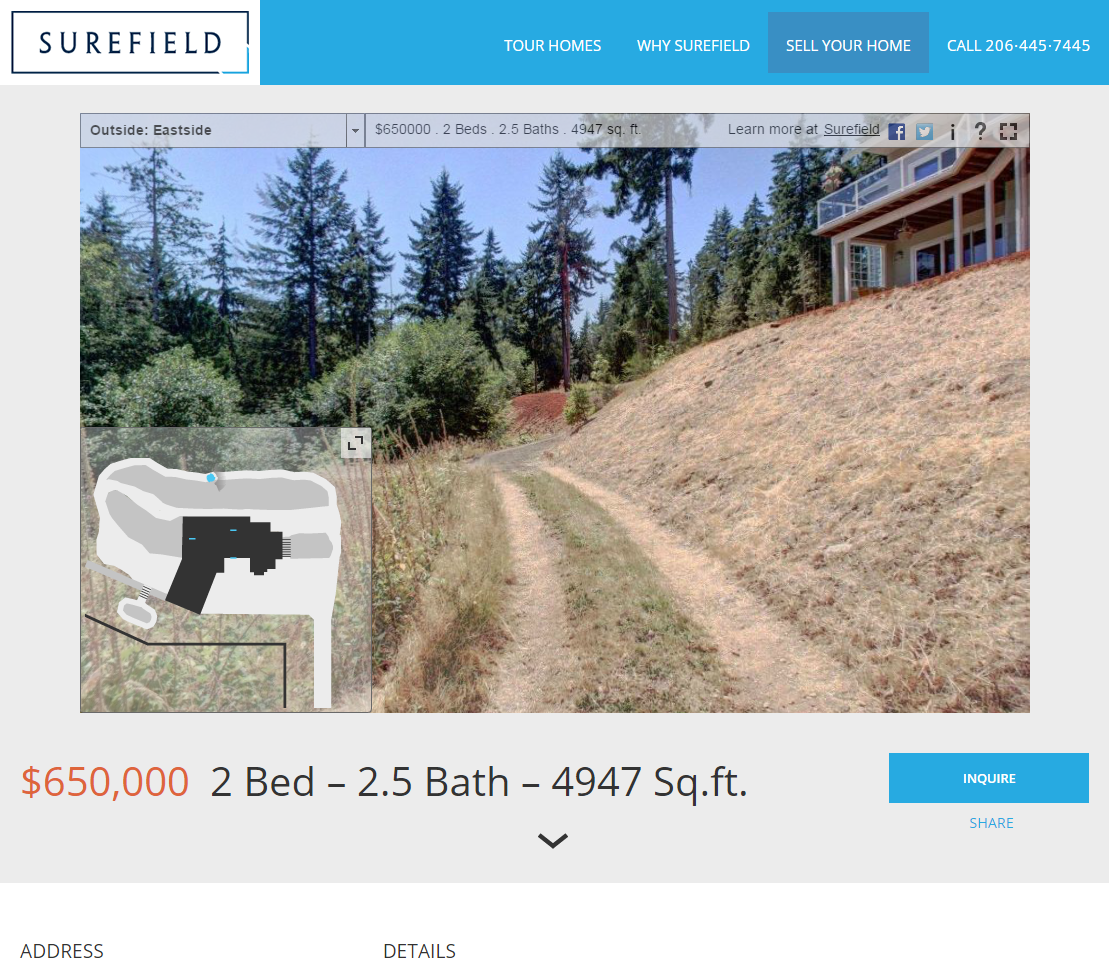
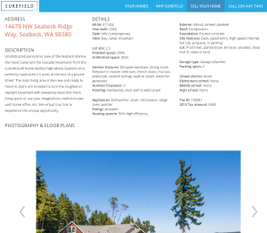
Surefield went with a very different and distinctive design—single column, 3D tour at the very top, big bold address and price under that, followed by a 3-column layout with the home’s description in the left column and the details in a bullet-free list format in the remaining two columns.
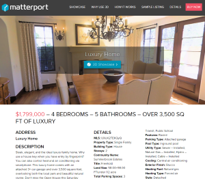
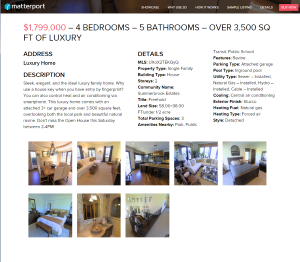
Apparently the design is a hit… with their competition, anyway. 3D tour technology heavyweight Matterport, who has raised $26 million since 2011 and recently rolled out a major partnership with Redfin, has pretty much completely design-jacked Surefield’s listing detail page.
Here’s a link to a Surefield listing detail page, and here’s a link to a Matterport listing detail page. Compare them below.
Matterport even jacked the shrinking top-bar feature from Surefield.
As well as I can tell Matterport didn’t straight-up copy any code, so this isn’t a sleazy as the Kirkland brokerage who ripped off Redfin code earlier this year. Still, you would think that a company with $26 million would be able to pay for an original design rather than just ripping off a smaller upstart competitor.
Full disclosure: The Tim is currently a Redfin shareholder.


