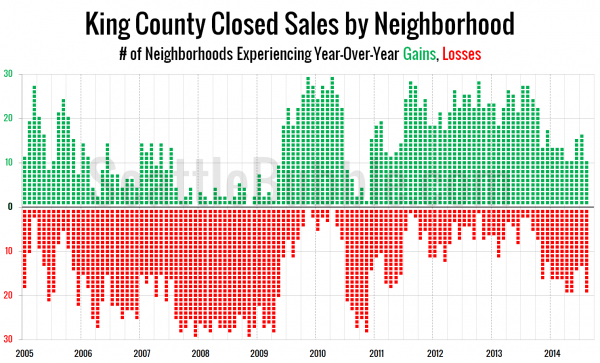
I thought it would be interesting to visualize year-over-year sales increases and decreases by NWMLS neighborhood in King County using the one of the views I created for Case-Shiller data. In the chart below each NWMLS-defined neighborhood in King County is represented by a green square if sales increased that month compared to a year earlier or a red square if sales decreased.
When viewed in this way, an interesting pattern becomes apparent. Although home prices did not bottom out until early 2012, sales began to increase in more neighborhoods than they were decreasing by mid-2011, and remained relatively strong all the way through late last year.
However, starting in November and continuing through the recently-released August data, the scales tipped back toward sales losses again.
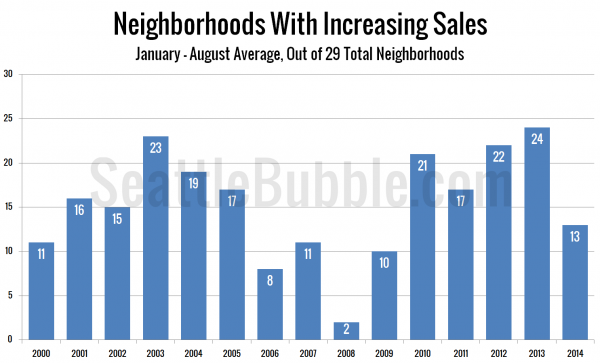
To get another view on how weak sales are this year, here’s a view of the average number of neighborhoods experiencing sales gains from January through August in each of the last fifteen years:
You have to go all the way back to the middle of the housing bubble bust in 2009 to find another year with sales growth in King County neighborhoods as weak as it has been in 2014.
It will be interesting to see if we hit another dip this coming November like we did last year, or if things level out.


