Let’s check out the three price tiers for the Seattle area, as measured by Case-Shiller. Remember, Case-Shiller’s “Seattle” data is based on single-family home repeat sales in King, Pierce, and Snohomish counties.
Note that the tiers are determined by sale volume. In other words, 1/3 of all sales fall into each tier. For more details on the tier methodologies, hit the full methodology pdf. Here are the current tier breakpoints:
- Low Tier: < $281,127 (up 0.2%)
- Mid Tier: $281,127 – $447,173
- Hi Tier: > $447,173 (up 0.2%)
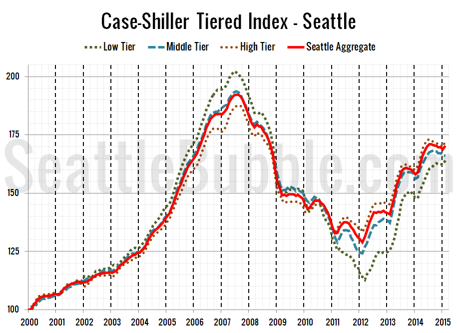
First up is the straight graph of the index from January 2000 through February 2015.
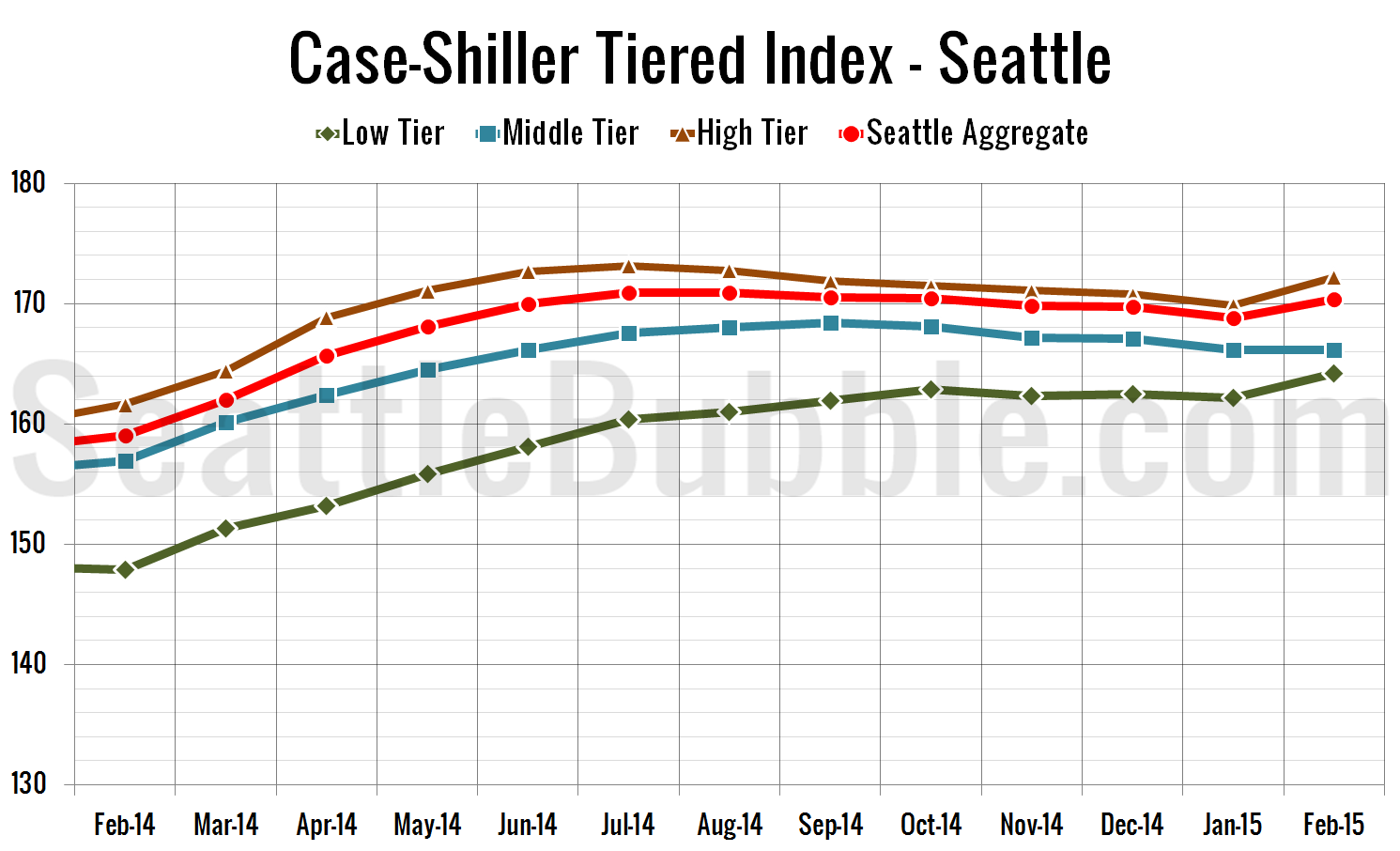
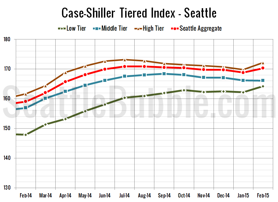
Here’s a zoom-in, showing just the last year:
The middle tier actually fell just a tiny bit in February, but the low ans high tiers both saw big gains.
Between January and February, the low tier increased 1.3 percent, the middle tier fell less than 0.1 percent, and the high tier gained 1.4 percent.
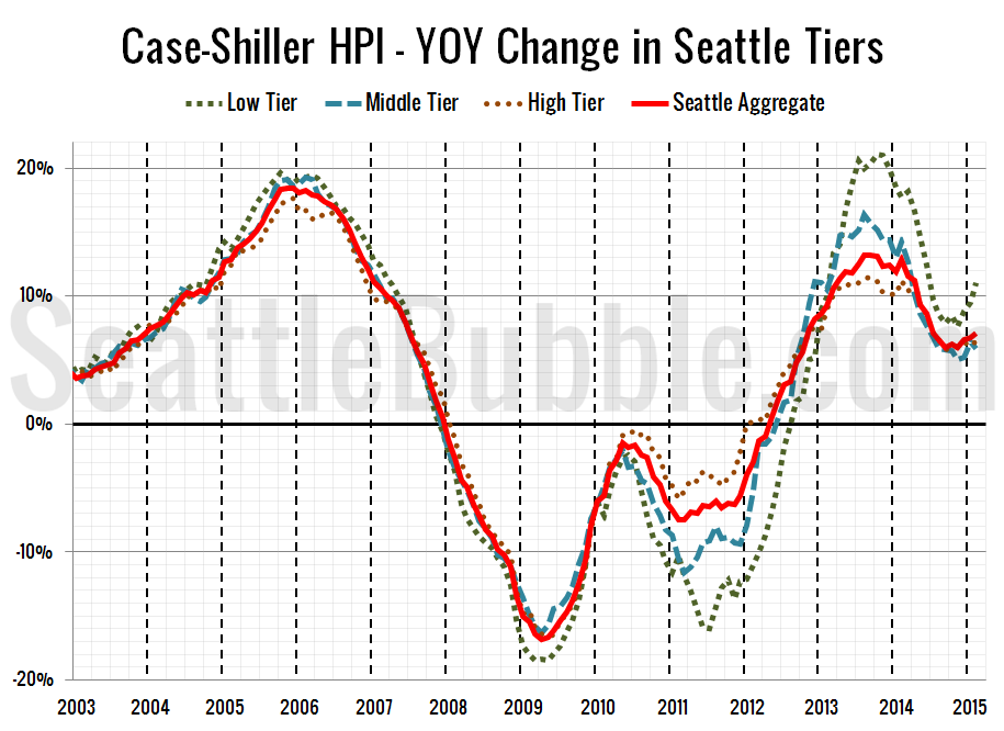
Here’s a chart of the year-over-year change in the index from January 2003 through February 2015.
Year-over-year price growth increased in the low and high tiers, but fell in the middle tier. Here’s where the tiers sit YOY as of February – Low: +11.0 percent, Med: +5.9 percent, Hi: +6.5 percent.
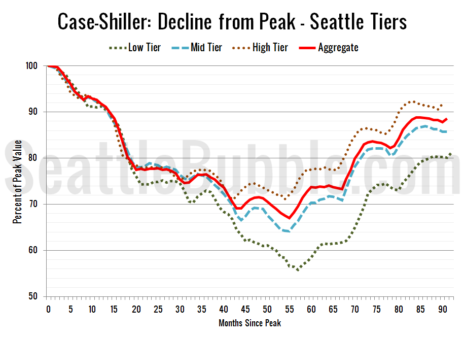
Lastly, here’s a decline-from-peak graph like the one posted yesterday, but looking only at the Seattle tiers.
Current standing is 18.9 percent off peak for the low tier, 14.3 percent off peak for the middle tier, and 8.2 percent off peak for the high tier.
(Home Price Indices, Standard & Poor’s, 04.28.2015)
