Get access to the full spreadsheets used to make the charts in this post by becoming a member of Seattle Bubble.
Let’s check out the three price tiers for the Seattle area, as measured by Case-Shiller. Remember, Case-Shiller’s “Seattle” data is based on single-family home repeat sales in King, Pierce, and Snohomish counties.
Note that the tiers are determined by sale volume. In other words, 1/3 of all sales fall into each tier. For more details on the tier methodologies, hit the full methodology pdf. Here are the current tier breakpoints:
- Low Tier: < $300,189 (up 1.4%)
- Mid Tier: $300,189 – $477,396
- Hi Tier: > $477,396 (up 1.2%)
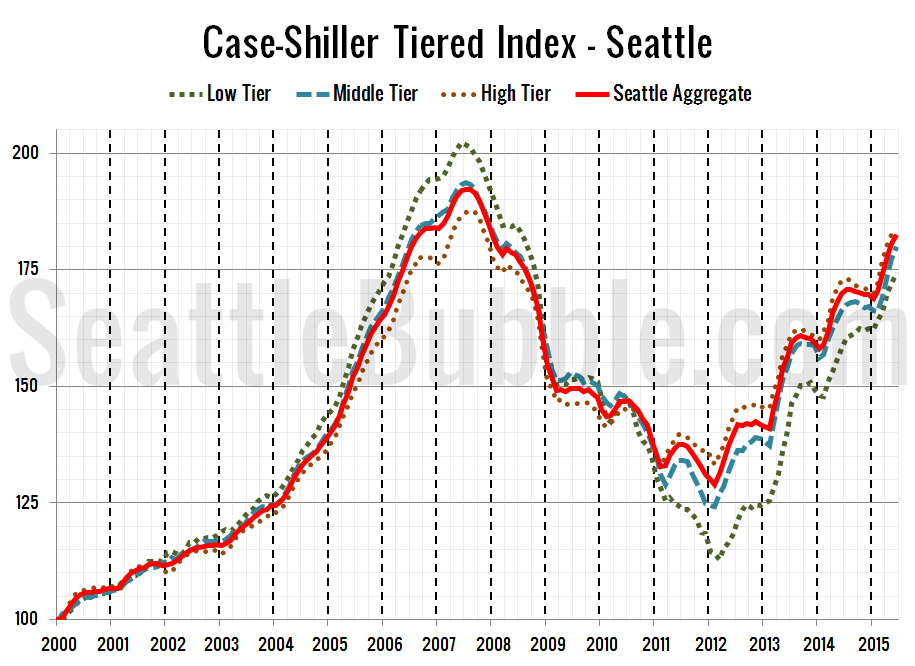
First up is the straight graph of the index from January 2000 through June 2015.
Here’s a zoom-in, showing just the last year:
All three tiers were up month-over-month yet again in June. The middle and high tier had smaller gains than we saw between April and May, but the low tier gains increased.
Between May and June, the low tier increased 1.4 percent, the middle tier rose 1.5 percent, and the high tier gained 0.8 percent.
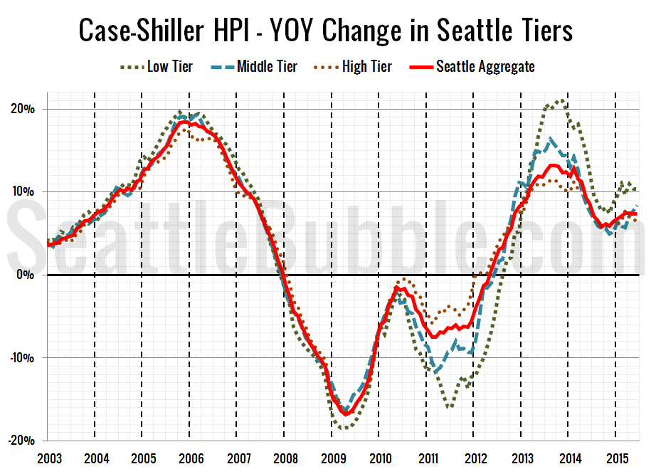
Here’s a chart of the year-over-year change in the index from January 2003 through June 2015.
Year-over-year price growth moved around unevenly across the three tiers, with the low tier holding steady, the middle tier increasing, and the high tier falling compared to May. Here’s where the tiers sit YOY as of June – Low: +10.3 percent, Med: +8.4 percent, Hi: +6.5 percent.
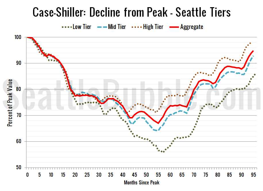
Lastly, here’s a decline-from-peak graph like the one posted yesterday, but looking only at the Seattle tiers.
Current standing is 13.8 percent off peak for the low tier, 7.1 percent off peak for the middle tier, and 1.9 percent off peak for the high tier.
(Home Price Indices, Standard & Poor’s, 2015-08-25)


